AEMO has released the 2026 Integrated System Plan, reaffirming renewables firmed by storage and backed by gas as the least-cost path as coal retires, with NEM consumption forecast to nearly double and a 35 GW home battery fleet expected by 2050.
AEMO has published the 2026 WEM Electricity Statement of Opportunities, finding that coordinated home batteries are already flattening WA’s evening peak and are expected to reduce grid-scale investment needs by 2028-29, with data centres appearing as a separate demand category for the first time.
The Australian Government has announced CIS Tender 8 results: 15 BESS projects totalling 4.2 GW/16.1 GWh were awarded, marking the second consecutive technology-neutral dispatchable tender where every winning bid was a battery.
The Queensland 2026-27 Budget confirms the government will continue progressing Borumba Pumped Hydro and conduct further investigations into the Capricornia pumped hydro project in Central Queensland.
The AEMC has commenced its Electricity Network Regulation Review, including consideration of a rule change request from Energy Networks Australia to allow distribution networks to install and operate kerbside EV charging infrastructure as a regulated service.
The AEMC’s final pricing review recommends shifting tariff complexity off household bills and onto retailers — pricing electricity “like milk” — while flagging up to $6 billion in network savings by 2040 and forcing retailers to disclose loyalty penalties.
Singapore-based Firmus is on track to become Tasmania’s single largest electricity user, with AI factories proposed across Launceston, Bell Bay and Wesley Vale targeting up to 400 MW — as much as 15% of state supply.
The AER has granted five-year trial waivers letting VIOTAS and Enel X enrol large multi-site industrial loads in the Wholesale Demand Response Mechanism, testing whether flexible demand can ease peaks and defer grid investment.
The Bureau of Meteorology has confirmed El Niño is underway, with the Niño3.4 index at +0.92°C — above its +0.80°C threshold — bringing the BoM into line with NOAA and the WMO and signalling a drier, hotter winter–spring for eastern Australia.
Endgame’s own piece, republished on WattClarity, argues the NEM’s deterministic planning hides tail risk and that the ESOO is no longer fit as a resilience instrument — making the case for stochastic modelling, stress-testing and wargaming.
INPEX is launching a commercial trial of blue hydrogen power generation in Niigata, with first electricity sales due mid-June from a 1 MW turbine made by Germany’s 2G — hydrogen made from domestic natural gas, with the CO₂ sequestered in a depleted nearby gas field.
Podcast of the week: Let Me Sum Up chat about the Domestic Gas Reservation Scheme draft Design Framework, which is out for consultation.
1. Confronting stochastic reality in the NEM to avoid planning blind spots
The way we plan the National Electricity Market (NEM) rests on a quiet assumption: that a handful of carefully chosen, deterministic input traces can stand in for a system that is, in reality, profoundly variable. Demand, weather, plant availability, gas use and price do not arrive as single, knowable numbers, they arrive as distributions. When we collapse those distributions to a central case and plan to it, we are not planning to reality. We are planning to an average the system may rarely, if ever, actually experience.
The danger is not that the central case is wrong. It is that everything around it, the tails, the compounding, the bad weeks, is precisely where reliability is won or lost, and a deterministic frame renders all of it invisible. This article makes three arguments:
That the inputs to our models are stochastic, so their outputs must be too.
That a system built to the average is not resilient to shocks without exposing itself to unserved energy.
That new tools, deliberate stress-testing and wargaming, backed by reform of the frameworks and the culture that commission them, can close these blind spots without throwing away what already works.
2. Modelling inputs are stochastic, and therefore outputs are stochastic too
Most modelling in the NEM is built on deterministic inputs. A planner selects a demand trace, a set of renewable traces, an outage assumption and a gas trajectory, runs the model, and reads off the result. It is clean and tractable, and it is not reflective of the system we actually operate. Demand, renewable output, forced outages, gas consumption, price and, ultimately, reliability are all stochastic. Each is better understood as a range of plausible outcomes than as a single line.
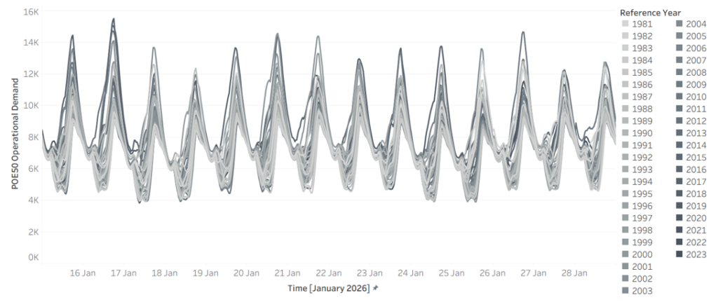
Start with demand. Figure 1 shows modelled NSW demand for a single fortnight, 15 to 28 January 2026, drawn across 45 weather reference years. The same calendar dates produce a wide envelope of outcomes depending only on which historical weather pattern is overlaid. A hot year sits well above a mild one, there is no single “January demand”, only a distribution of it.
Figure 1 – Demand in 2026 for NSW across 45 weather reference years (x-axis 15 January to 28 January, y-axis NSW demand)
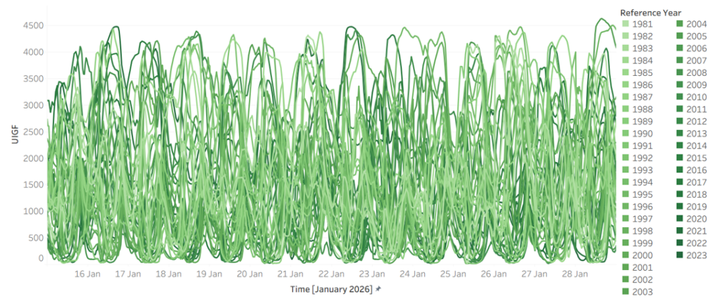
Weather is the driver, and it is at least as variable. Figure 2 shows Victorian wind generation over the same fortnight across the same 45 reference years. Output swings from near-zero to abundant over identical calendar dates, year to year. The combinations matter more than any single series: the years that deliver low wind are not always the years that deliver mild demand, and it is when high demand and low wind coincide that the system is most exposed.
Figure 2 – Wind in 2026 for Victoria across 45 weather reference years (x-axis 15 January to 28 January, y-axis VIC Wind)
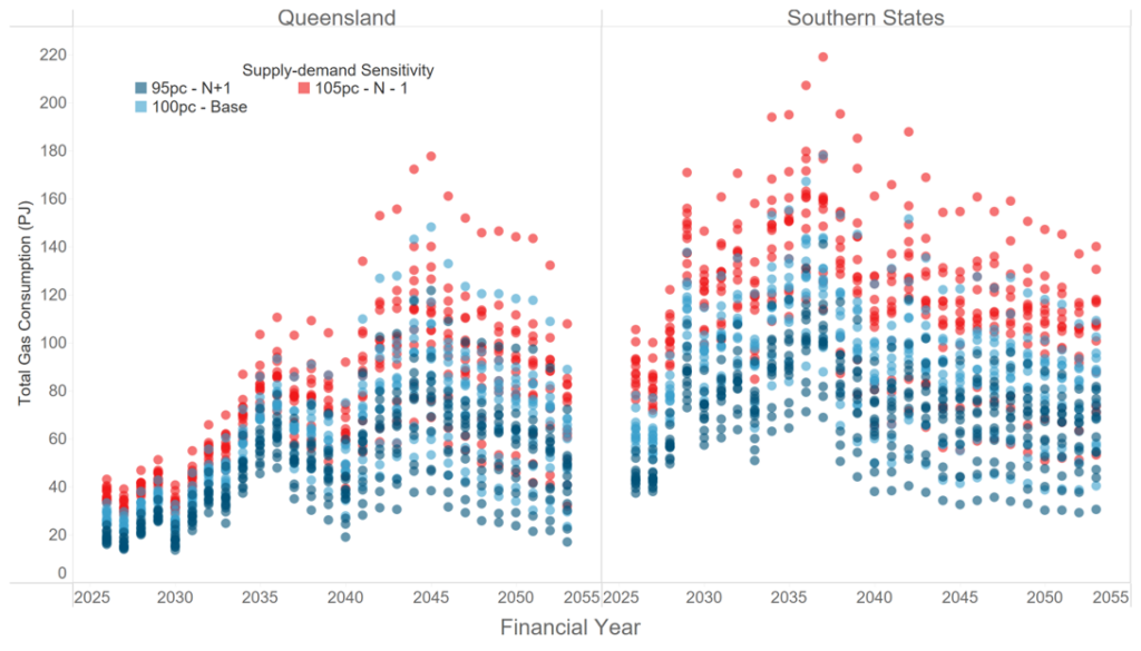
That variability propagates downstream. Figure 3 shows total gas consumption by gas-powered generation (GPG) by financial year, across reference years and under demand sensitivities of 95%, 100% and 105%. The spread is wide, and unsurprisingly so. GPG is the system’s reserve capacity, called on most heavily exactly when renewables are short and demand is high, so its consumption inherits and amplifies the variability sitting above it.
Figure 3 – Total gas consumption by GPG across reference years and supply sensitivities
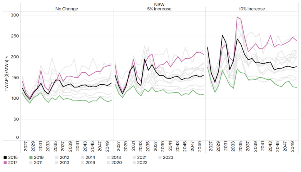
If the inputs are stochastic, the outputs cannot be anything else. Figure 4 makes this concrete: annual time-weighted average price (TWAP) in NSW under the Endgame Headwinds scenario, by weather reference year and under demand increases of 0%, 5% and 10%. A single deterministic run returns one number from this distribution, and, crucially, tells you nothing about how wide the distribution around it really is.
Figure 4 – Headwinds annual TWAP ($/MWh) in NSW by weather reference year and demand sensitivity
A deterministic model does not produce a wrong answer, it produces one draw from a distribution it never reveals. Two planners working from defensible but different central assumptions can arrive at materially different prices, dispatch patterns and reliability outcomes, with nothing in either result to signal how much sat unexamined in the tails.
3. A system built to the average is not resilient to shocks with unserved energy
The Integrated System Plan (ISP), the document that frames two decades of investment, uses a rolling reference year approach. It is a reasonable way to keep a twenty-year model tractable, but by construction it does not account for the stochastic nature of the NEM, and it tends toward a central, expected trajectory. That should prompt three uncomfortable questions. What does an average-based plan hide about how the system actually behaves? What does it tell us about the true shape of the operating envelope? And what does it tell us about resilience?
The honest answer to all three is: not enough. Averaging smooths away the very combinations that decide reliability, the simultaneous hot, low wind, high-outage conditions that seldom appear in a central case but routinely appear in the tails. A plan calibrated to the middle of the distribution can look entirely adequate while leaving no headroom for the adverse-but-plausible week.
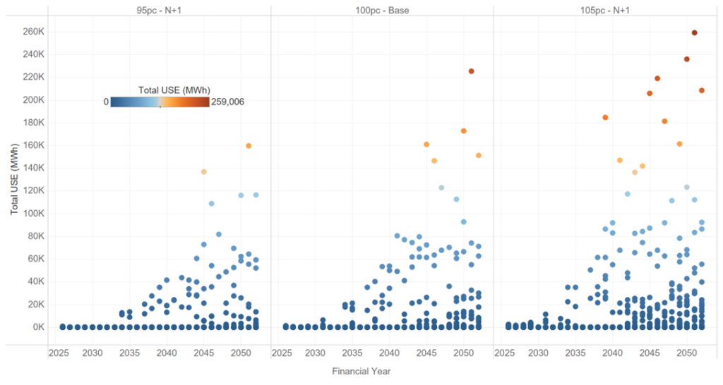
Figure 5 shows what surfaces when you look across the distribution rather than at its centre: projected unserved energy (USE) in NSW under the Endgame Sunny Side Up scenario, across 13 weather reference years and three demand sensitivities. In many years and sensitivities, USE is negligible. In others, it is not. A system that looks reliable on average can carry real unserved energy risk once the full spread of weather and demand it must withstand is accounted for, and that risk is invisible to any single central run.
Figure 5 – Projected USE in NSW for Sunny Side Up scenario across 13 weather reference years and 3 demand-supply sensitivities.
This is why “build to the average” is a dangerous frame. What keeps the lights on in a bad year is not the average outcome, it is the headroom the system carries against the tail. A plan that optimises to the centre will, almost by definition, treat that headroom as surplus and strip it out. The implication is uncomfortable but hard to avoid: the Electricity Statement of Opportunities (ESOO), in its current form, is no longer fit for purpose as a resilience instrument. A framework anchored to a narrow band of demand probabilities and weather years cannot characterise the risks that live in the tails, and those risks are exactly what we most need to understand.
4. New tools, wargaming and stress testing can greatly improve existing frameworks
None of this is an argument for discarding the ISP or the ESOO. The discipline they impose is real and worth keeping. We see the task in four parts: designing better studies, building the capability to run them, reforming the institutions that commission them, and breaking the culture that has held all three back.
The first shift is in how the studies themselves are designed. Too much is currently assumed away in the name of tractability. A more honest approach would:
Look much further into the future, to the system we are committing to deliver, not the system we have. The consequential question is whether the fleet we are spending billions to build will hold up under the weather and demand it will eventually face.
Characterise the full distribution of outcomes, moving beyond POE10 and POE50 demand traces and the handful of weather years that conventionally underpin reliability assessments, and drawing on much larger weather datasets.
Treat unit commitment and system security as part of the study, not an afterthought. Having enough energy on paper means little if the system cannot be operated securely when conditions are at their worst.
Bring gas demand and gas constraints inside the analysis. Gas-powered generation is the reserve capacity the system leans on in precisely the conditions that produce unserved energy, yet gas supply and transport limits are too often left at the edge of the model.
Deliberately try to “break” the system, actively hunting for the weaknesses and holes in the current approach, rather than assuming away the tough questions because they are inconvenient.
We can change our current planning frameworks using:
New tools. We need models that can be run faster, more cheaply and at far greater scale, so that exploring thousands of plausible futures becomes routine rather than exceptional. The combinatorics of weather, demand and outages cannot be brute forced with tools built for a handful of deterministic runs.
Wargaming. Borrowing from the security world, ‘blue team / red team’ exercises are a powerful device: one team is tasked with finding ways to break a future system, while the other works to remedy the weaknesses they expose. The adversarial structure uncovers failure modes that a single, consensus seeking study tends to overlook.
Stress testing. The aim is not only to ask whether a system is reliable, but to work out what it would take to break it. Knowing the distance to failure, and the conditions that get us there, is far more useful for decisions than a single pass/fail verdict against a central case.
5. Reforming the frameworks and the institutions
Better methods will not stick unless the regulatory framework asks for them, and two reforms stand out.
The first is to overhaul the ISP so that its centre of gravity shifts from transmission to the viability of the system as a whole. The process should assess future system needs and how the system will actually be operated, answering questions such as what the gas system will need to provide, what the system security requirements are, how the system will be operated through difficult periods, and what margin of safety is required to deliver adequate outcomes for society.
The second is to stand up an independent panel to stress test the system. A standing panel of industry experts should run stress testing and wargaming exercises on an annual basis. To keep them free from political interference, the exercises themselves should not be public, but the panel should publish a public facing report setting out its findings and recommendations. That structure preserves candour while keeping the conclusions accountable.
6. Breaking the groupthink
Underneath the technical and regulatory questions sits a cultural one. The current lack of innovation in how we model the future power system has produced a textbook case of groupthink: the same findings are confirmed again and again, and the ISP and ESOO processes are so heavily regulated that there is little room to do anything differently. The result is a planning conversation that mostly reinforces its own assumptions. Escaping it will take a governance structure that actively rewards new approaches rather than penalising those who depart from the consensus.
The NEM is becoming more weather dependent, not less. As thermal capacity retires and variable renewables and storage take its place, the gap between the average year and the bad year will only widen, and so will the cost of planning blind to it. The reasonable response is not to model the world as simpler than it is, but to confront its variability head-on: to treat stochastic inputs as stochastic, to plan for the distribution rather than its midpoint, and to build the margin of safety that resilience demands. This all starts with stochastic thinking.
Authored by: Kevin Yang, Matthew Bungate and Oliver Nunn
IEEFA finds just 5.6 GW of solar sits on Australian commercial and industrial rooftops today against a forecast 17–31 GW by 2050, with the “missing middle” stalled by patchy incentives, inconsistent network tariffs and slow grid connections.
Transgrid has energised EnergyConnect, the 900 km interconnector linking NSW, Victoria and South Australia, adding 800 MW of transfer capacity and room for 2 GW-plus of new renewables.
ARENA is tipping in another $13.6 million to scale its vehicle-to-grid trial to 1,000 households (total funding now $16.8 million), with BYD leading work to resolve carmakers’ battery-warranty concerns.
The Australian Energy Council looks to Ireland’s new rule forcing data centres to source 80% of demand from additional renewables, as local data-centre load is tipped to climb from about 2% of NEM consumption to 12% by 2050.
NOAA has declared El Niño underway with the equatorial Pacific at record-warm early-June levels, signalling a hotter, drier summer that lifts cooling demand and bushfire risk across the grid.
The AFR warns slow renewables and transmission build is leaving consumers poorer, citing Net Zero Australia findings that large-scale wind now takes around eight years, and solar farms over five, to develop.
Australia’s emissions fell 2.1% in 2025, with renewables hitting a record 46.5% of NEM generation in Q1 2026. Battery discharge nearly tripled, gas hit its lowest share since 2000, and wholesale prices dropped 12% year-on-year to $73/MWh.
CSIRO launched FlexCost — a framework to quantify the cost of activating demand-side resources (EVs, home batteries, ACs) during grid stress. Generation costs are well understood; flexibility costs have not been, until now.
CommBank’s Vivek Dhar calls global oil markets a “calm before the storm” — Brent has eased from ~$120 to the mid-$90s on Hormuz tension, but stockpile buffers are finite. Prices could hit $150 if supply disruptions persist, or fall to $80 if a deal is reached.
Kansai EPCO (Greater Osaka) is targeting a 30% capacity expansion by 2040, including new LNG builds and a potential next-gen nuclear unit at Mihama — Japan’s first new nuclear build since Fukushima.
The CEC’s Clean Energy Australia 2026 report shows renewables hit 43% of Australia’s electricity in 2025 and Australia is now the world’s third-largest utility-scale battery market — but new wind and solar investment has fallen to a decade low.
Western Australia is leading Australia’s charge as a global battery nation, underpinned by surging home battery installations and the state’s position as the world’s largest lithium supplier.
Leaked BHP documents reveal they quietly shelved billions in Pilbara decarbonisation projects and delayed its electric truck rollout — while continuing to buy new diesel fleets.
A May heatwave in the UK — with amber heat-health alerts issued across England — has prompted fresh questions about whether the country’s infrastructure, housing stock and health systems are built for a hotter climate.
Sumitomo (major Japan trading company) and ENEOS (Japan oil major) have announced that they’ve “paused” their green hydrogen project w/ Malaysia’s SEDC Energy announced in late 2023.
NSW launched its biggest-ever renewable energy tenders this week, opening Tender 8 for 2.5 GW of new generation (with a new hybrid solar-battery LTESA product) and Tender 9 for 12.5 GWh of long-duration storage, as the state aims to replace its ageing coal fleet.
Green light to build first Aussie-made electric ferry. After it’s built, the new 24-metre, battery electric ferry will be trialled for 12 months from early 2028 and is likely to service the new Sydney Fish Markets route when it enters passenger service in 2029.
Star of the South opened its draft Environmental Impact Statement and Victorian Environment Effects Statement for public review, marking the first step in Australia’s first offshore wind environmental approvals process. It could take an additional five years to become fully operational.
South Australia moved to bolster fuel security this week, announcing a strategic diesel reserve of up to 20 million litres to be stored at Port Bonython amid escalating concerns over global fuel supply disruptions linked to conflict in the Middle East.
An east coast gas reserve has been announced, from July next year, Queensland’s three LNG ventures will be required, by law, to set aside 20 per cent of their export volumes for Australian users.