Skip to Content

Load bearing

What data centres do to the NEM, & the regulatory path to manage it

Data centres are no longer a hypothetical addition to the National Electricity Market. AEMO’s 2026 Electricity Statement of Opportunities, published in August, counted 225 known data centre projects at various stages of the connection process, with proposed connection capacity across all stages having risen from 38 GW to 67 GW over the past year. This article models the consequences of that arrival for the power system, then closes with our regulatory review – our position on the AEMC and AEMO proposals now on the table to manage it, and a practical action plan for data centres.

This piece models a range of build scenarios of data centres, first with all mainland states available and a second set of modelling sensitivities that removes Queensland from the candidate set entirely, which for the time being, has far fewer data centres projects going ahead. Second, in the regulatory review that closes the piece, we set out our position on the four recommendations in the AEMC’s July 2026 advice to the Energy and Climate Change Ministerial Council on data centre regulatory pathways, and on AEMO’s July 2026 rule change request on the operational integration and visibility of large inverter-based loads.

We take our house view of the NEM – the Headwinds scenario – and treat data centre load as flat and inflexible: a hyperscale campus runs at a load factor near 90%, with little seasonal signature and near indifference to time of day. We state that assumption up front because it matters – if data centres can flex meaningfully, for example by drawing on backup generation as demand response, these results are an upper bound on the disruption caused. We do not model that flexibility here. Instead, it is reserved for bespoke modelling. Critically, a flat load profile is a poor match for the system we are building. A NEM increasingly dominated by solar has energy to spare in the middle of the day and very little to spare overnight. A load that draws the same power at 2am as at 2pm is, in effect, a request for firm overnight energy.

Checking the scale of our modelling against AEMO’s own numbers takes some care, because the two are not built on the same base. Our Headwinds case already carries its own data centre and large-load growth, rescaled from the 2025 ESOO. This is about 23 TWh nationally by 2035‑36 before we add anything. Our 500–5,000 MW scenarios sit on top of that. AEMO’s 2026 ESOO, published a year later, forecasts total data centre consumption reaching around 34 TWh (13% of NEM operational consumption) by 2035‑36 under its central case, which is an upward revision from the assumptions embedded in our base case equivalent to roughly 1,400 MW of our own incremental scenarios, in just twelve months. Add our full top scenario to the Headwinds base and total data centre consumption reaches around 62 TWh by 2035‑36 – roughly 80% higher than AEMO’s newest central forecast. Put another way, most of our scenario range now tests a more aggressive data centre future than AEMO itself expects in the 2026 ESOO, and even at the top of that range we are not modelling a reliability crisis.

Where the load goes, and what it costs

We ran two sets of sensitivities over the Headwinds scenario: one with every mainland subregion available to the model, and one with Queensland removed from the candidate set. Both start from the same solved zero-load case, and in every chart below Queensland-available sits on the left and Queensland-excluded on the right. Placement is decided on least system cost at the sub-regional level. Within each set of sensitivities, load is added a tranche at a time, where a tranche is an additional 500 MW of data centre load landing on 1 July 2028. Once a tranche is placed it stays placed, so each successive run tells us where the next 500 MW would go given everything that came before it. Throughout, the model is free to re-optimise the generation and storage build in response to the new load.

Concentration is structural, not Queensland-specific

With Queensland available we test ten discrete data centre scenarios, in 500 MW increments from 500 MW up to 5,000 MW. Excluding Queensland, we run a coarser sweep of five to the same 5,000 MW. Each is a separate case rather than a phase-in. The 5,000 MW scenario means 5 GW of data centre load already online on 1 July 2028, not a gradual path to that point. What accumulates across the runs is the siting, not the timing – the tenth run places its 500 MW knowing where the previous 4,500 MW went. This matters for reading every chart that follows, because the x-axis is a menu of alternative futures, not a timeline.
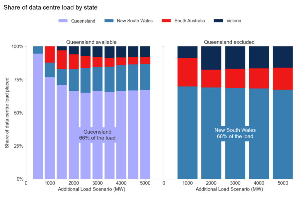
Queensland takes 66% of the load when it is available. Remove it and New South Wales takes a near-identical 68%. A policy that steers load out of one region relocates the concentration rather than dissolving it. The sharper element of this is not on the chart, because it is a zero value. No load is placed in the Sydney basin in either sweep – New South Wales’ share goes to the state’s far south and far north, away from the population centres. The efficient answer never points at the actual load centre. The case for planning efficient locations does not depend on Queensland being the answer, but rather on concentration being predictable and pointed somewhere different from where developers are actually building.

Every gigawatt of load pulls in about five gigawatt of new plant

This is the chart that matters most. In the long run, every gigawatt of data centre load requires 4.93 gigawatt of new wind, solar, storage and gas peaking. That ratio holds regardless of where the load is sited. Both sweeps converge on the same 4.93 requirement by around 2043, and stay there. The composition is also consistent. Solar and wind carry the bulk of it from the earliest years, with OCGT and batteries layered on top to firm the last stretch. That ratio is what a flat load costs in a weather-dependent system. One gigawatt drawing continuously needs about 8.8 TWh a year, and wind and solar deliver at capacity factors of a quarter to a third. The remaining quarter of the build is batteries and gas peaking, which are there to carry that energy into the hours the load still draws and the weather does not deliver.

What differs is not the destination but rather the journey to get there. With Queensland available, lighter scenarios sit well below the 4.93 line through the mid-2030s. The system is drawing on spare capacity rather than building toward the requirement. Exclude Queensland and the climb is steeper and earlier, with less of the volatility that comes from leaning on existing plant. The next chart shows that difference in timing.

The build does not shrink but instead is brought forward
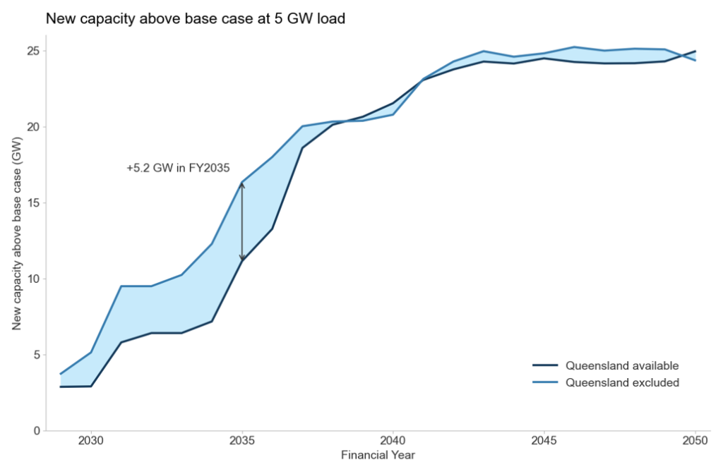
Both sweeps finish within about a gigawatt of each other. In particular, 23.1 GW of new capacity above the base case at FY2041, converging to 24.9 GW against 24.4 GW by FY2050. The end-state build does not depend on where the load sits. This is the same 4.93 ratio from the chart above, expressed in absolute gigawatts instead of a per-GW rate.

The timing is what shifts between the scenarios. The Excluding Queensland scenario needs 12.3 GW of new capacity by FY2034 against 7.2 GW when Queensland is available (ie, 71% more) with the gap peaking at 5.2 GW in FY2035 and closing only from FY2038. This is the breathing-room effect – ie, Queensland’s existing coal fleet is spare, dispatchable capacity the system can lean on immediately. It follows that siting load against it defers the new-build requirement rather than avoiding it. A flat, 24/7 load is exactly what increases a coal plant’s capacity factor. Move the load to New South Wales, Victoria and South Australia and it cannot reach that coal in Queensland. Instead the system must build its way to the objective, instead of dispatching its way there.

Prices redistribute rather than rise
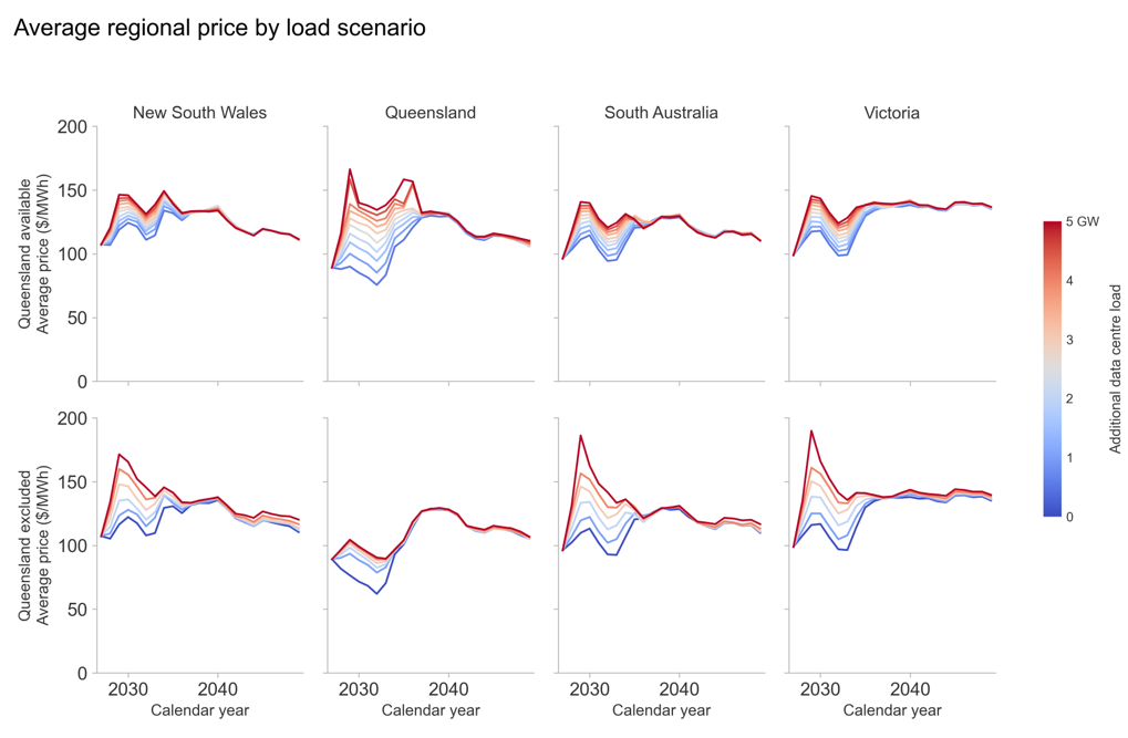
Average annual spot prices fan out sharply as the load arrives in 2029, then close again by the end of the 2030s. With Queensland available the effect is overwhelmingly a Queensland one, with prices there reaching $166/MWh in 2029 against a base case of $77/MWh. Site the same load elsewhere and Queensland’s spike goes, but the spike does not leave the market. Instead, it relocates and splits three ways. In 2029 Victoria reaches $190/MWh, South Australia $186 and New South Wales $172.

Averaged across the horizon the trade is a clean transfer. Queensland pays substantially less (−$19.28/MWh), while New South Wales, Victoria and South Australia each pay between $6.80 and $8.00/MWh more, and the market-wide average is virtually unchanged.

Siting is a distributional question, not an efficiency one. A debate conducted in total system cost will, in the long run at least, conclude that it barely matters where the load goes provided the necessary new generation can be built in time. However, one conducted in regional price outcomes will conclude that it matters enormously.

Eventually the load is served overwhelmingly by new renewables
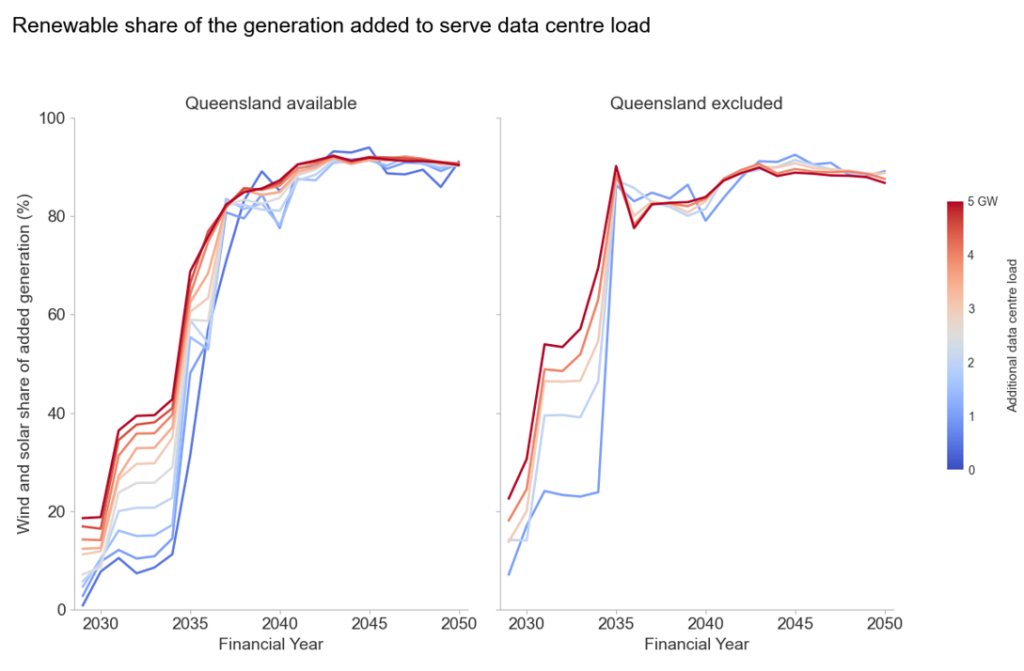
Adding load makes the system build and generate more. This chart asks where that extra generation comes from. For each case we take the generation added to serve the load (the difference from the same run with no data centres) and ask what fraction of it is wind and solar. Through the 2030s that fraction climbs faster the larger the load. In FY2034 it runs from 11% at 500 MW to 43% at 5,000 MW, because a larger commitment pulls renewable build forward. All cases converge above 90% in the early 2040s. Siting also has strong impact on this speed. With Queensland available the share is up to 27 points lower through the mid-2030s, because the load leans on the existing coal and gas fleet instead.

In the near term, load is served by coal and gas, which increase their market share

This is the same arithmetic but interpreted in another way. Coal’s whole of market share falls from about 49% to 15% between FY2029 and FY2040 in every case, which is the scenario’s own coal exit rather than anything related to data centres. The load changes the spacing between the lines. With Queensland available, more load lifts coal’s share by up to 5.4 percentage points in FY2029 and 2.8 by FY2034, because the load sits beside the coal fleet and it runs harder. Exclude Queensland and the lift is half as large, and fades from FY2031 onwards. From FY2035 the order reverses and the heavier cases show a lower coal share because the denominator is growing. In absolute terms coal generation still rises with load in almost every year.

Gas becomes a larger share of total generation as more load is added and the system transitions to renewables
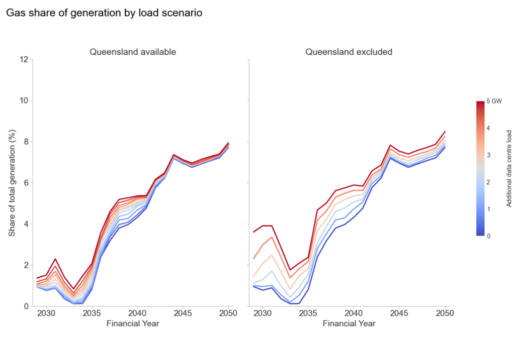
Gas moves in the other direction in every year of both sweeps. More load means a higher gas whole of market share. Without Queensland the effect is roughly double – ie, about 3 percentage points at 5 GW through the early 2030s versus 1 percentage point with Queensland. The share of gas is small throughout, rising from about 1 per cent to 4 per cent as coal leaves, so these are large moves on a small base. Load sited away from the existing thermal fleet gets firmed by gas instead.

Within the day, the cost lands in the evening peak
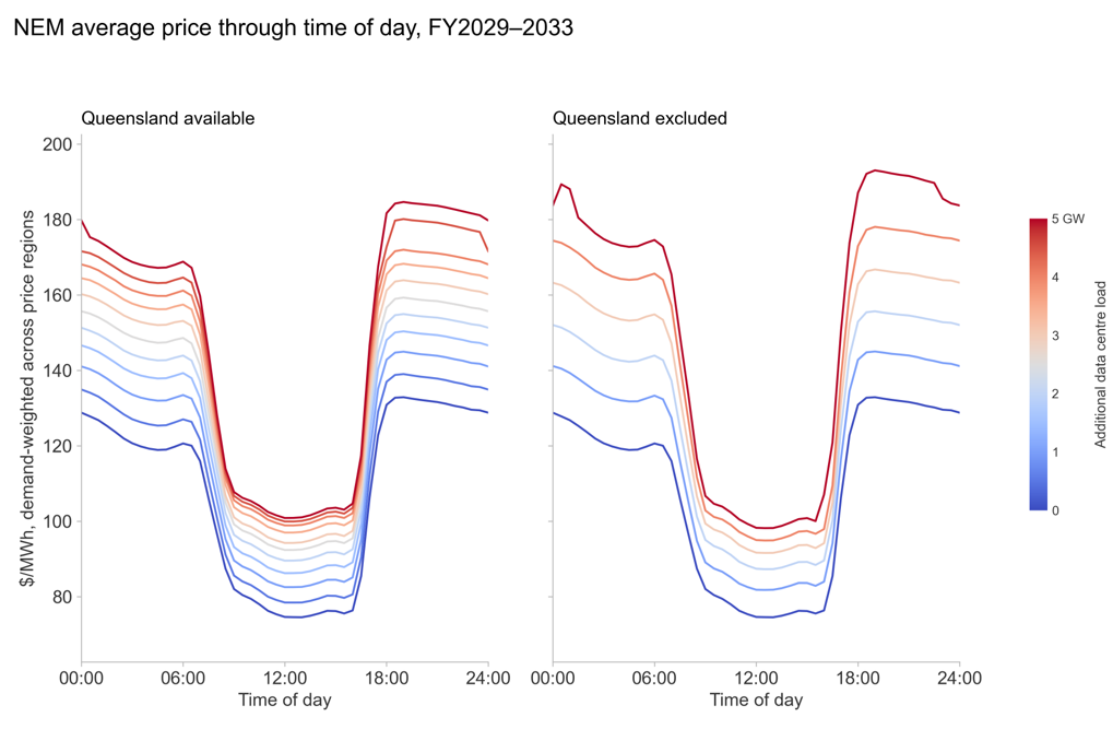
This is the demand-weighted NEM price through the day, averaged over FY2029–2033, the first five years of load. A flat 24/7 load lifts the evening peak more than the middle of the day trough. With Queensland available, 5 GW adds $26.50/MWh across the midday solar window but $49.90 to the evening peak. Midday has surplus generation to absorb it, whereas the rest of the day does not. Dispersing the load makes this worse. Excluding Queensland trims the midday uplift to $24.20 and pushes the evening to $57.10, taking the peak-to-trough ratio from 1.68 with no load to 1.73 concentrated and 1.84 dispersed. This is a battery operator’s revenue widening with additional load in the system. The evening-to-midday spread at the 0GW base case is $51.80/MWh which increases to $75.20 with 5GW of additional load if Queensland is available, and to $84.70 if it is not.

What the data centres pay and when they pay it
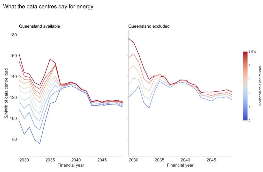
This chart shows what the data centres themselves pay for energy. Each case’s bill divided by the energy it draws, priced at the reference node of whichever state each megawatt is sited in, so the whole spread is a siting outcome. The premium for arriving at scale occurs in the short term and then disappears. In FY2029, with Queensland available 5 GW of load pays $161.8/MWh against $97.8/MWh for 500 MW. That gap of $64/MWh closes to $4.50 by FY2037 and averages $3.60 across the 2040s. Greater load does raise the price the load itself pays, so a developer’s cost of energy depends on how much other data centre load turns up alongside it. However, the exposure is to timing rather than to the size of the pipeline. This is because a load arriving after the build has caught up pays close to what a small load pays. Excluding Queensland lifts the whole price fan. A horizon averages $124.5/MWh to $138.1/MWh against $110.0/MWh to $131.8/MWh, and leaves a wider residual spread in the 2040s.

For existing consumers, the first gigawatt is the expensive one  
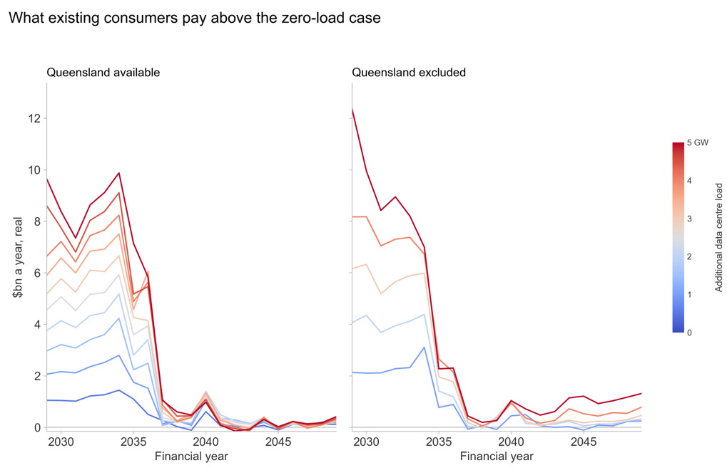
The load pushes up prices and everyone already in the system pays those prices too. This chart helps visualise that bill. We plot each region’s price weighted by the demand that was there before the data centres arrived, less the same figure from the run with no load. That weight (ie, the existing demand in the system) is identical in every case, so what separates the lines is the price and nothing else. There is therefore a significant cost to consumer to bear the additional load in the short term, but it is a transitional cost which largely disappears in the late 2030s.

Wired in: the regulatory pathway

Put these findings together and a consistent picture emerges. New data centre load is met, in sequence, by whatever headroom already exists. Existing VRE and rooftop solar generation first, then spare coal and gas capacity, particularly where load is sited against it. Prices rise through the gap until new VRE, storage and gas peaking arrive to close it, converging on the same 4.93 GW-per-GW requirement regardless of where the load lands. Demand response from data centre backup generation could plausibly shrink that requirement further. We have not modelled that here, consistent with treating the load as flat and reserving demand response for bespoke modelling.

The government appears to be targeting regulation at three objectives:

  • new supply so prices do not increase;
  • new renewables and firming, so that emissions do not increase; and
  • quick connection of data centres, so that we can obtain the benefits of these investments.

It is unlikely that all three objectives can be met, irrespective of any regulation that is imposed. Heavy-handed regulation is unlikely to be able to balance the three. The modelling above suggests the market is already well-positioned to resolve these objectives on its own: a price increase, more dispatch from existing generation, and a dynamic supply response from industry, arriving roughly in that order. That is the frame we bring to the regulatory review below.

In July 2026, the AEMC provided advice to the Energy and Climate Change Ministerial Council setting out four recommendations for a data centre regulatory pathway, namely:

  • a Renewable Energy Guarantee of Origin (REGO) offset obligation,
  • a contract/firmness obligation modelled on the Retailer Reliability Obligation,
  • a market registration requirement, and
  • streamlined connection agreements for co-located or flexible load.

In the same month, AEMO lodged a separate rule change request (ERC0455) on the operational integration and visibility of large inverter-based loads, which is a broader category that includes data centres, electrolysers and battery charging hubs. The rule change has not yet been formally initiated by the AEMC. We consider each recommendation in turn.

REGO offset obligation should be dropped, not imposed on data centres

The AEMC’s first recommendation would require data centres to surrender a to-be-determined proportion of time-matched REGO certificates from new renewable generation to offset their consumption. We think this recommendation is trying to do two jobs at once – drive new VRE investment, and certify data centre consumption as genuinely renewable – and is likely to satisfy neither, while inheriting every existing weakness of the RET/GOO architecture.

Large Generation Certificates (LGCs) and REGOs are currently in oversupply relative to demand. The Renewable Energy Target has been met, voluntary surrender sits below available surplus, and prices are low. Inserting a new mandatory-demand class restricted to new generation only creates an artificial, policy-driven wedge of demand against a market that is currently oversupplied. This will split the certificate market between new and old project supply, and demand between voluntary and mandatory surrender for data centres. More fundamentally, REGOs and LGCs are fungible, untagged as new-project-versus-existing once issued, and not yet meaningfully time-matched because there is no mature mechanism, such as for a battery to buy a REGO while charging on solar and sell one on discharge in the evening. The costs of this proposal also hinge entirely on a proportion that is, at this stage, undetermined.

Data centres are already voluntarily underwriting new VRE investment. Indeed, cleaner, investable power is part of what draws them to Australia in the first place. It follows that there is no revealed market failure here that requires a mandatory, data-centre-specific obligation. In our view this recommendation more plausibly reflects government’s own concerns about its capacity to procure new renewables than a genuine gap in data centre behaviour. Our preference is to drop the mandatory obligation, or at minimum rely on voluntary surrender, unless and until REGO design is mature to carry genuine temporal granularity.

Our own modelling above reinforces this. The long-run build response to data centre load is overwhelmingly renewable regardless of siting or regulation. Wind and solar already account for the bulk of the 4.93 GW built per GW of load, from the earliest years of the outlook. New, REGO-eligible generation arrives as a by-product of ordinary market response to the load, not something that needs to be forced into existence by an offset obligation.

The contract obligation misreads how data centres procure electricity

The AEMC’s second recommendation would require data centres to demonstrate sufficient firm contract coverage to the AER, drawing on the RRO’s Contracts and Firmness Guidelines, with penalties including early curtailment for non-compliance. This assumes data centres will manage their own firmness position directly – effectively becoming their own market customer.

Any load can choose to do this, but in practice sophisticated end users use retailers. They do so for economies of scale, hedging capability, trading expertise and origination relationships with generators. Expecting data centres to become de facto retail market participants, on top of building and connecting a facility, misreads how the sector organises itself and underestimates the burden involved. Shifting the obligation to the data centre’s retailer instead does not cleanly resolve this either, because it ring-fences the data centre’s load as a discrete parcel when in reality it sits inside a broader retail portfolio that is already subject to financial risk, which is risking duplication with obligations the retailer already carries for its whole book.

We think the better path is to let the market do what it is meant to do. PPAs with developers, retail contracts, and the incremental load itself, when priced into the market, signalling and bringing forward new supply –ie, the ordinary mechanism the NEM relies upon. There is no clear case for a bespoke, data-centre-specific contract-coverage mandate layered on top of it.

This is consistent with what the modelling shows. The incremental capacity the market builds first in response to data centre load is renewable capacity – solar and wind form the base of the build stack from the earliest years, with firming layered on top only as it is needed. Firm capacity is not scarce or slow to arrive, but instead it is what the market already produces without a bespoke contract mandate.

Registration should be light-touch, not duplicate the retailer or the NSP

The AEMC’s third recommendation – ie, mandatory market registration for large data centres – is best read alongside AEMO’s own proposed registration category for large inverter-based loads. We support a genuinely light-touch model, ie, registration scoped to direct operational liaison with AEMO. SCADA and telemetry, modelling, and agreed procedures, with some elements manageable through the NSP’s connection agreement rather than needing separate registration – plus AEMO’s power of direction under NER clause 4.8.9 and the data centre’s reciprocal right to claim compensation. These are hygiene factors for both AEMO and data centres. Getting them resolved cleanly, without scope creep, is what puts data centres in a position to engage constructively on the substance elsewhere.

Market settlement, metering, and demand response participation should continue to run through the parties already registered to serve data centres, ie, retailers, and, for demand response, the Wholesale Demand Response Participants. Data centres should actively resist any move toward full scheduled-unit status, as though they were a generator or a battery, or toward financially responsible Market Customer status, as though they were a retailer. Their demand response can be “unbundled” and be managed by a Wholesale Demand Response Participant.

Connection agreements are the wrong vehicle for bundling in flexibility or reliability commitments

The AEMC’s fourth recommendation proposes faster connection pathways for data centres that co-locate with generation or firming, or that enter flexible demand agreements with networks, backed by jurisdictional data centre infrastructure plans. We think this conflates two different regulatory instruments and is not workable as designed.

Schedule 5.3 access standards set the technical performance of connecting plant. This includes parameters that can be embedded directly in AEMO’s power system models, such as fault ride-through. Negotiated access standards are a mechanism for negotiating that technical performance between the automatic and minimum standard. They are not a vehicle for bundling in demand-flexibility commitments, reliability contributions, or other market and financial obligations in exchange for a faster connection. Judging each connection against a broader commercial criteria is not how the Rules’ connection framework is built to operate and is not a feasible retrofit onto Schedule 5.3 or the negotiated access standards process.

AEMO’s rule change is the one worth engaging on

AEMO’s ERC0455 rule change request is deliberately outcomes-focused and principles-based rather than settled rule text. It covers four broad areas:

  • streamlined monitoring and communication,
  • efficient investment signalling through advance notice of demand shifts,
  • near-real-time demand management, and
  • improved event management.

It has not yet been formally initiated by the AEMC and appears under-specified. Even so, we think it is the proposal data centres should prioritise, because it can directly address a scenario every other regulatory exposure ultimately traces back to. That is, a data centre drawing power from the grid while AEMO is intervening in the market by shedding consumer load. Data centres should not resist clear, agreed, market-integration, ex-ante direction and disconnection protocols. Refusing them risks the reputationally toxic scenario described above, and resolving them ex-ante is what lets AEMO manage lack of reserve (LOR) conditions without resorting to consumer load shedding in the first place.

Explainer on Lack of Reserve

AEMO is required to keep the system within satisfactory limits and operate the system securely. A power system is vulnerable to instantaneous loss of a single largest generator or transmission element, known as a credible contingency. Being “secure” means the system can withstand a contingency and remain within satisfactory operating limits.

Reserves are the difference between supply and demand. If reserves are forecast too thin, the system is no longer secure. A contingency, should it happen, would push the system outside those limits and risk uncontrolled, cascading failure across the wider grid. Shedding load is how AEMO restores that security margin by deliberately cutting some demand before a contingency occurs, it brings the system back to a state where it can withstand a credible contingency and remain satisfactory.

AEMO tracks this constantly through its reserve forecasting process, and when projected reserves start to run thin it issues a graded set of public warnings called LOR notices. LOR1 signals reserves have dropped below a set threshold and prompts AEMO to encourage generators to offer more supply or large consumers to cut demand. LOR2 means reserves are projected to fall below the single largest contingency in the region, at which point AEMO can direct generators to run or activate emergency reserves such as the Reliability and Emergency Reserve Trader (RERT) to clear the LOR2 from the forecast. LOR3 is the most serious level, when forecast available supply is at or below forecast demand. No reserve buffer is forecast, and load shedding becomes a real possibility to maintain a secure operating state.

This matters for data centres because they are exactly the kind of large, concentrated, always-on load that shows up in AEMO’s reserve calculations. A single hyperscale campus can rival a mid-sized power station in demand, meaning its addition to a region can materially erode the reserve margin AEMO is protecting. Ideally, any backup generation a data centre holds on site should itself be counted in AEMO’s reserve calculations, and the data centre should be able to switch to that backup and disconnect from the grid to clear a forecast LOR2, thus helping avoid the shortfall progressing to LOR3 rather than adding to the problem.

Telemetry provided by the data centre directly or via the NSP should feed AEMO’s energy management system (EMS), real-time contingency analysis and constraint formulation, so the load is priced into security assessments rather than sitting as a blind spot. Critically, it should let AEMO separate a data centre’s steady-state, behavioural load from weather-driven consumer load, producing a clean five-minute dispatch target and pre-dispatch estimate, with dispatch able to adjust to data centre step-changes rather than being blindsided by them. The same SCADA data should measure actual load against its five-minute trajectory for Frequency Performance Payment and Regulation FCAS cost allocation on a proper causer-pays basis – which we would expect to reduce these costs for data centres, not increase them.

A genuine prize is unbundling the demand response of the operation of the backup generation for the data centre load, by participating in the Wholesale Demand Response Mechanism, not RERT. Data centres should be able use a third party participant Wholesale Demand Response Participant to submit bids, get paid for the megawatt, and be counted in AEMO’s reserve calculations. This reduces the frequency of AEMO interventions, directions and load shedding. RERT looks commercially attractive on the surface, with availability and utilisation payments and the ability to place technical limitations on AEMO under contract, but it is inefficient, cumbersome, opaque, and not a long-run solution.

One element is under-baked and worth pushing back on. The proposed ramp-rate limit on large inverter-based loads. Given the volume of battery storage already in the system providing ramping capability, data centres trip to backup only when genuinely required. A bespoke ramp-rate rule solves a problem the system already handles. Load variation over a five-minute window is directly observable via SCADA and can simply be priced through FPP and Regulation FCAS cost allocation, consistent with the causer-pays approach above.

Our two cents

We suggest to data centre owners and investors that they should beware being a facility that draws power from the grid with backup generation idle when consumers are being shed. Or if you are that data centre ensure AEMO is fully aware of why the backup generation cannot operate and it must instruct load shedding instead. The way to foreclose it is operational, not financial, ie, engage constructively on AEMO’s rule change, and offer demand response from backup generation wherever the facility can genuinely carry it.

  • Accept, and lean into:
    • Light-touch LIBL registration scoped to operational liaison, telemetry and AEMO’s direction/compensation framework, not full Market Customer or Scheduled Load status.
    • Full SCADA and telemetry provision feeding AEMO’s EMS, contingency analysis, constraint development and a load-separated operational forecast.
    • Causer-pays FPP/Regulation FCAS cost allocation based on measured five-minute load trajectories.
    • Clear, agreed, ex-ante direction and disconnection protocols
    • Backup generation as WDRM demand response, bidding price, volume and availability, displacing RERT as the long-run mechanism.
  • Push back on:
    • Mandatory REGO surrender tied to new-generation supply, which inherits the flaws of an already oversupplied certificate scheme and is better resolved by dropping the obligation or fixing REGO design so certificates carry genuine temporal granularity.
    • A data-centre-specific contract/firmness obligation modelled on the RRO, which the existing retailer-portfolio RRO exposure and ordinary PPA and retail contracting already handle.
    • Any proposal to bundle demand-flexibility or reliability commitments into Schedule 5.3 access standards or the negotiated access standard connection process, which misuses an instrument built for technical performance rather than commercial terms.
    • Ramp-rate limits on large inverter-based loads as currently proposed, which duplicate protection the system already has through battery penetration, fault ride-through standards and SCADA-based cost allocation.
  • Sequencing:
    • Treat AEMO’s ERC0455 rule change as the priority engagement. It is the mechanism through which operational trust, visibility and a genuine WDRM pathway for backup generation get built. Resolving it well is what earns data centres the credibility to contest the AEMC’s REGO and contract proposals from a position of good faith rather than obstruction, rather than trading the two agendas off against each other in a single package.

None of this requires treating the arrival of data centres as a crisis for the power system to be managed away by regulation. The modelling above says the opposite. The load will be accommodated, largely by resources the system already has, at a price and on a timeline the market is well placed to work out for itself. Provided new regulation puts the technical and operational connections between data centres and AEMO in place before the load arrives, not after.

Appendix A: Method notes

Scenario and assumptions:

  • Endgame Headwinds reference case for the NEM;
  • Load modelled as flat and inflexible, ie, a load factor near 90%, indifferent to time of day and season so these results are an upper bound if data centres flex in practice.
  • Placement decided on least system cost at the sub-regional level, with the generation and storage build free to re-optimise in response to the new load at every run.

Held fixed and not modelled here:

  • weather and outage variability (a stochastic treatment would likely worsen 2030s outcomes and shift the storage/gas split);
  • the transmission plan (generation responds to the load, the network does not);
  • demand response from data centre backup generation; and
  • a constrained build, ie, the model builds whatever the load requires, without testing whether the connection queue and supply chain could actually deliver it on this timeline.
Cutting the cord

What cancelling VNI-West means for the energy market and the future power system

VNI-West sits in the forward plan for the NEM, but its future is now uncertain. It has been the subject of a long and difficult public debate about cost, route and land use, and there is a live possibility that the project does not proceed. Most of the analysis published on the project to date has been directed at the explicit cost of the project. Comparatively little has been directed at what the world looks like with and without the project, and in particular the key question: what does the power system look like without VNI-West and what must happen in its place?

Against this backdrop, in this article we consider a range of projections to improve our understanding about the consequences of the project not proceeding. We do not seek to express views on the non-quantitative merits of the project, on whether its costs are reasonable, on the land use and social licence questions along the route. Those are matters to which a model has nothing useful to contribute. What a model can do is trace the consequences for the power system, the electricity market, and the broader energy system.

We take our reference case for the NEM, remove VNI-West, and consider what happens when we do nothing, or when we allow the model to re-optimise the generation and storage build in response. We consider three questions:

  • What happens to prices, in Victoria and elsewhere?
  • What does the system build instead?
  • What does that build do to gas consumption?

The short answer is that the price effect is large and it persists, the system does not really replace the interconnector so much as run a more expensive version of itself without it, and the difference is accounted for by increased consumption of gas for power generation.

Where the project stands

VNI-West entered the 2022 ISP as a staged actionable project. AEMO Victoria Planning and Transgrid published the PACR in May 2023, identifying a 500 kV double-circuit line from Bulgana on the Western Renewables Link to Dinawan on Project EnergyConnect as the preferred option. AEMO ran the feedback loop against the 2023 IASR and the Draft 2024 ISP in December 2023 and confirmed the project remained on the optimal development path, and the AER approved the Stage 1 early works contingent project application in May 2024.

The project has been retained as actionable in the 2024 and 2026 ISPs. Over that period the Victorian route has moved, the delivery vehicle has changed, and the cost estimate has risen from a little under $4.0 billion at the time of the Stage 1 application to $7.6 billion in the 2026 ISP, carried with an accuracy range of minus 30 to plus 50 per cent.

Our method

We start from our headwinds reference case for the NEM and construct three cases for comparison.

  • The first is the base case, with VNI-West delivered on its current timing in our reference case. Importantly, our reference case already assumes delays to VNI-West.
  • The second is the naive removal case. We take VNI-West out of the forward plan and change nothing else – the same generation and storage build, in the same places, at the same times. This is deliberately artificial.
  • The third is the re-optimised case. We take VNI-West out and let the model rebuild: generation, storage and firming are all free to respond, subject to the same build limits and connection constraints as the base case.

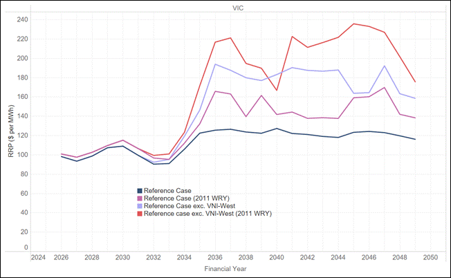
We report outcomes on our standard weather reference year, but also for some charts on a 2011 weather reference year. The 2011 reference year combines a harsh summer with a winter that sees sustained wind droughts across the southern states. Chart 2 explains why the choice of reference year does a great deal of the work in this analysis.

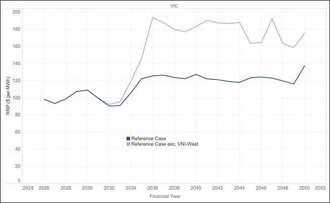
Chart 1 – The naïve price effect in Victoria, and how long it lasts

Chart 1 shows average annual spot prices in Victoria for the reference case and the naïve case without VNI-West. The two cases are indistinguishable to FY2033. They separate in FY2034, and by FY2036 the case without VNI-West is at $194 per MWh against $126 in the reference case. From that point the gap averages around $56 per MWh and never closes. It is at its widest in FY2036 and again in FY2044, at close to $70 per MWh, and at its narrowest in the mid-2040s, at around $40. In the last year of the outlook it is still $38.

Chart 1 – Removing VNI-West lifts Victorian prices by around $56 per MWh from FY2036

Average annual spot price in Victoria, reference case versus reference case excluding VNI-West

Chart 2 – Outcomes under a 2011 weather reference year

Chart 2 adds a 2011 weather reference year to both cases, giving four lines: the reference case and the case without VNI-West, each run on standard weather and on the 2011 trace. The price level rises sharply. Without VNI-West, a 2011 trace produces Victorian prices above $210 per MWh in six years of the outlook and a peak of $236 per MWh in FY2045, against $124 in the reference case on standard weather in the same year.

Chart 2 – Under a 2011 reference year the removal effect is markedly greater

Average annual spot price in Victoria, standard weather and 2011 weather reference year

An interconnector earns its keep on a small number of days a decade, under exactly the conditions the 2011 trace reproduces, because that is when the diversity between regions is doing the heaviest lifting. Averaging across reference years does to an interconnector what averaging across a year does to a peaker: it produces a number that is arithmetically correct and analytically useless.

We made a version of this point in our November 2021 Chart of the Month on Vic-NSW. Interconnectors derive a large part of their value from the uncertainty of future outcomes, because they increase the diversity of supply options, and yet the models used to value them are typically deterministic and assume perfect foresight. If we know the future, there is no value in a hedge against uncertainty. Five years on, the models have improved at the margin, but the point still stands.

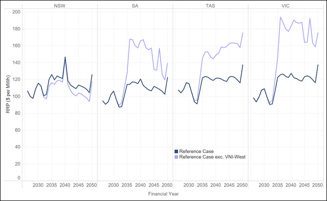
Chart 3 – This is not just a Victorian question

Chart 3 shows the same comparison across four regions. South Australia is affected almost as heavily as Victoria. Prices without VNI-West run around $50 per MWh above the reference case from FY2036 through to the mid-2040s, peaking near $168 per MWh in FY2036 against $114. Tasmania is $30 to $45 per MWh higher over the same period. New South Wales moves the other way: from the early 2040s, prices there sit some $5 to $12 per MWh below the reference case, because energy that would have moved south stays in the region.

Chart 3 – South Australia and Tasmania bear price increases nearly as large as Victoria

Average annual spot price by region, reference case versus reference case excluding VNI-West

The mechanism is not complicated, but it is routinely missed. Interconnectors also affect prices in neighbouring regions, sometimes for the better and sometimes for the worse. The practical consequence is that the effects of the decision are not restricted to Victoria, and they are not symmetric. A change of $50 per MWh in South Australia is not a rounding error.

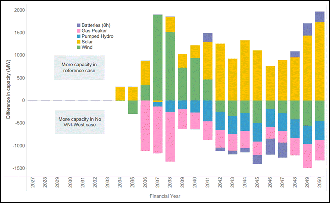
Chart 4 – What the system builds instead

We now turn to the re-optimised case. Chart 4 shows the difference in new capacity between the base case and the re-optimised case by technology and year. Bars above the line are capacity the reference case builds but the removal case does not; bars below the line are capacity built only in the case without VNI-West.

The first thing to say is that this is not a replacement. Without the network, the renewables cannot be delivered, so the model does not build them. It builds a smaller, more gas dependent fleet and runs it harder.

Chart 4 – The system does not replace VNI-West. It substitutes gas peaking and deep storage for VRE

Difference in new capacity by technology and financial year, reference case less case excluding VNI-West

Underneath the total there is a clear substitution. Through FY2036 to FY2038 the reference case builds around 1.5 GW a year more solar and wind, while the removal case brings forward roughly 1.2 to 1.5 GW a year of gas peaking. The pattern continues with more gas and deep storage replacing more wind and solar. Interestingly the No VNI-West case builds materially more pumped hydro as it tries to firm a system that no longer has a second path to New South Wales.

The replacement is not like-for-like in either technology or location: it is gas peaking and deep storage in place of solar, wind and network, sited to reach load on the existing system rather than to reach the resource.

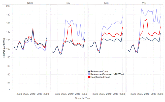
Chart 5 – The consequences for prices under the re-optimised case

So what does this mean for prices. Chart 5 shows the same analysis as Chart 3 but now includes prices for the re-optimised case. The important point here is that the price increases associated with the new build case persist. The reason for this is the increased use of gas for power generation in the Southern states.

Chart 5 – Even with re-optimisation the price increases persist in Victoria and Tasmania

Average annual spot prices, reference case versus re-optimised and reference case excluding VNI-West

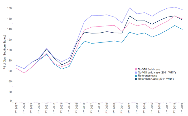
Chart 6 – The consequence for gas under the re-optimised case

Chart 6 shows gas consumption for electricity generation in the Southern States across all four cases: reference and re-optimised, each on standard weather and on the 2011 trace. Gas burn rises by roughly 20 to 28 PJ a year from the mid-2030s onwards, an increase of between a third and a half on the reference case. The divergence opens in FY2035 and, like the price effect, does not close. The extreme weather year is when the system most needs gas, and removing the interconnector also raises the requirement.

Chart 6 – Southern states’ gas consumption rises by 25 PJ a year, more under a 2011 reference year

Gas consumption for GPG in Southern States, 2015 and 2011 weather reference years

The southern gas market is already tight. Southern supply has been declining faster than southern demand for some years, the balance is met by northern gas moved south through pipeline capacity that is fully subscribed on peak days, and it is peak-day capability rather than annual quantity that binds.

We cannot be certain whether that gas can be delivered, because much can happen in the domestic market between now and the 2030s. But we can say that it is one of the questions on which the removal case turns.

Our two cents

  • The system does not replace VNI-West, it substitutes for it, and the substitution is worse. We expected the model to build its way back to something close to the reference case outcome and it does not. It leans on gas peaking and deep storage, and leaves Victorian prices around $20 per MWh higher for the rest of the outlook. Removing an asset like this from the forward plan is not a decision to avoid a capital cost. It is a decision to accept a permanently more expensive system unless something cheaper is put in its place.
  • The price effect does not fade, which is unusual and which changes how the decision should be framed. In most of the work we do, a shock to the system produces a transitional price effect that closes once the build catches up. Here the build has fifteen years to catch up and does not. We are removing a key piece of strategic infrastructure from the grid. A decision framed as a saving of $7.6 billion in capital is, on these results, a decision to add tens of dollars per megawatt hour to southern prices indefinitely.
  • The value of a line like VNI-West is the value of an option, but we keep measuring it as though it were a pipe. Chart 2 is revealing – the value under the 2011 weather year is markedly higher than under a median year. The value is concentrated in the tail events, and a framework that prices interconnectors on median outcomes across a scenario weighting will underprice it in a way that is superficially rigorous. This is a general problem with how we (as an industry) value network assets – not a feature of VNI-West.
  • The effects are national and they are not symmetric. South Australia carries an increase of up to $30 per MWh and Tasmania up to $20 per MWh, while New South Wales is slightly better off. This shows that this is not just an issue for Victoria, but rather a consideration for all the Southern states.
  • The benefit of planning certainty is itself an input to cost, and it does not appear anywhere in a RIT-T. A developer looking at any future transmission project has to price the probability that the project is unwound before it is delivered, and that probability is now visibly non-zero. A forward plan that is revisited whenever costs move or circumstances change raises the risk premium on every project that it comprises, and that premium is paid by consumers.
  • Applied consistently across all future transmission projects, the RIT-T and ISP framework that has been applied to VNI-West would ultimately dispose of most of the forward transmission plan. Every major line has the same profile: costs that escalate between the PACR and the final estimate, and benefits concentrated in tail years that the central case dilutes. If that combination is sufficient to remove a project from the plan, the same logic reaches into every other major transmission project. A counterfactual worth modelling is one in which the sector builds very little new transmission at all, and each region solves its problem locally with gas. That is a coherent system with an estimable cost, and we should estimate it rather than arrive at it by accident, one project at a time.

About Endgame

Endgame Analytics is an economic and mathematical consultancy that specialises in energy. We bring expertise in optimisation, quantitative analysis, and critical thinking to solve complex problems.

Confronting the stochastic reality of the National Electricity Market to avoid planning blind spots

1. Confronting stochastic reality in the NEM to avoid planning blind spots

The way we plan the National Electricity Market (NEM) rests on a quiet assumption: that a handful of carefully chosen, deterministic input traces can stand in for a system that is, in reality, profoundly variable. Demand, weather, plant availability, gas use and price do not arrive as single, knowable numbers, they arrive as distributions. When we collapse those distributions to a central case and plan to it, we are not planning to reality. We are planning to an average the system may rarely, if ever, actually experience.

The danger is not that the central case is wrong. It is that everything around it, the tails, the compounding, the bad weeks, is precisely where reliability is won or lost, and a deterministic frame renders all of it invisible. This article makes three arguments:

  1. That the inputs to our models are stochastic, so their outputs must be too.
  2. That a system built to the average is not resilient to shocks without exposing itself to unserved energy.
  3. That new tools, deliberate stress-testing and wargaming, backed by reform of the frameworks and the culture that commission them, can close these blind spots without throwing away what already works.

2. Modelling inputs are stochastic, and therefore outputs are stochastic too

Most modelling in the NEM is built on deterministic inputs. A planner selects a demand trace, a set of renewable traces, an outage assumption and a gas trajectory, runs the model, and reads off the result. It is clean and tractable, and it is not reflective of the system we actually operate. Demand, renewable output, forced outages, gas consumption, price and, ultimately, reliability are all stochastic. Each is better understood as a range of plausible outcomes than as a single line.

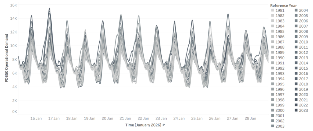
Start with demand. Figure 1 shows modelled NSW demand for a single fortnight, 15 to 28 January 2026, drawn across 45 weather reference years. The same calendar dates produce a wide envelope of outcomes depending only on which historical weather pattern is overlaid. A hot year sits well above a mild one, there is no single “January demand”, only a distribution of it.

Figure 1 – Demand in 2026 for NSW across 45 weather reference years (x-axis 15 January to 28 January, y-axis NSW demand)

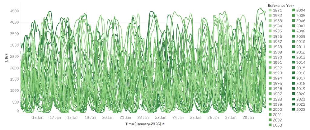
Weather is the driver, and it is at least as variable. Figure 2 shows Victorian wind generation over the same fortnight across the same 45 reference years. Output swings from near-zero to abundant over identical calendar dates, year to year. The combinations matter more than any single series: the years that deliver low wind are not always the years that deliver mild demand, and it is when high demand and low wind coincide that the system is most exposed.

Figure 2 – Wind in 2026 for Victoria across 45 weather reference years (x-axis 15 January to 28 January, y-axis VIC Wind)

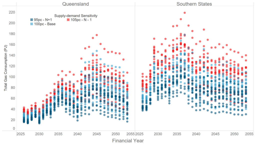
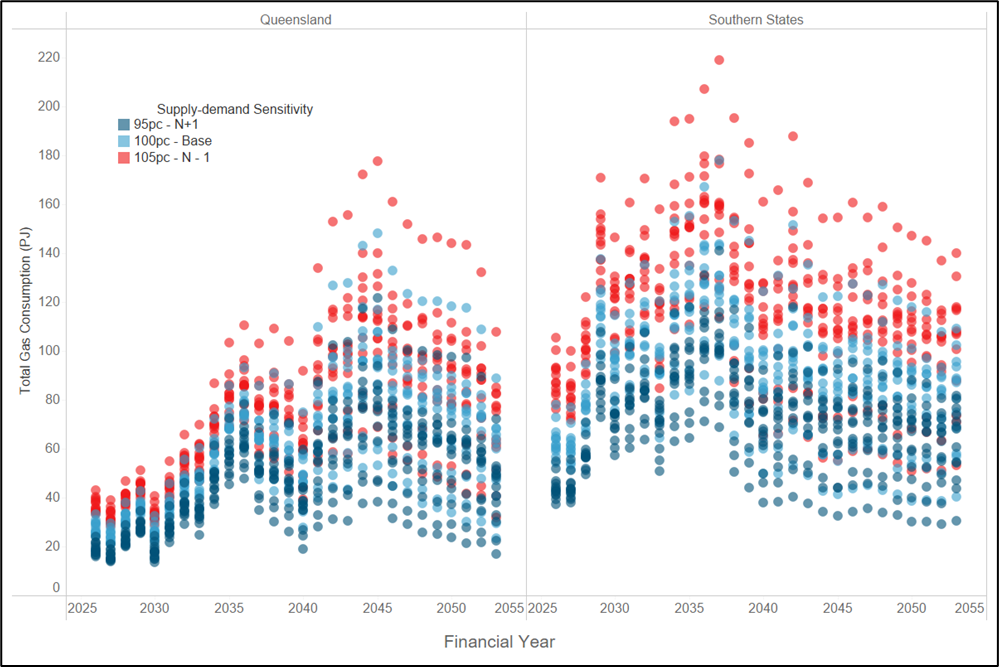
That variability propagates downstream. Figure 3 shows total gas consumption by gas-powered generation (GPG) by financial year, across reference years and under demand sensitivities of 95%, 100% and 105%. The spread is wide, and unsurprisingly so. GPG is the system’s reserve capacity, called on most heavily exactly when renewables are short and demand is high, so its consumption inherits and amplifies the variability sitting above it.

Figure 3 – Total gas consumption by GPG across reference years and supply sensitivities

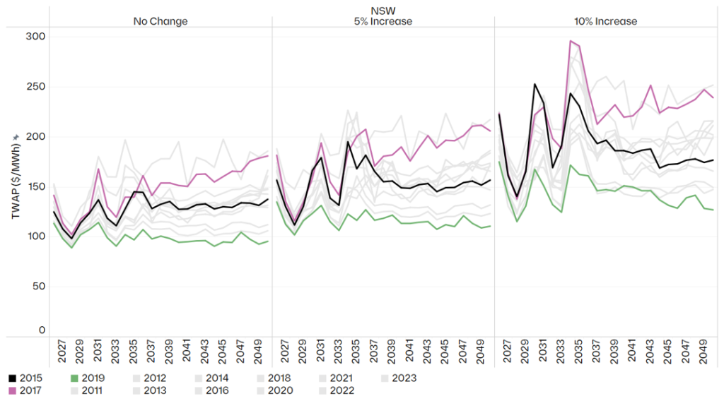
If the inputs are stochastic, the outputs cannot be anything else. Figure 4 makes this concrete: annual time-weighted average price (TWAP) in NSW under the Endgame Headwinds scenario, by weather reference year and under demand increases of 0%, 5% and 10%. A single deterministic run returns one number from this distribution, and, crucially, tells you nothing about how wide the distribution around it really is.

Figure 4 – Headwinds annual TWAP ($/MWh) in NSW by weather reference year and demand sensitivity

A deterministic model does not produce a wrong answer, it produces one draw from a distribution it never reveals. Two planners working from defensible but different central assumptions can arrive at materially different prices, dispatch patterns and reliability outcomes, with nothing in either result to signal how much sat unexamined in the tails.

3. A system built to the average is not resilient to shocks with unserved energy

The Integrated System Plan (ISP), the document that frames two decades of investment, uses a rolling reference year approach. It is a reasonable way to keep a twenty-year model tractable, but by construction it does not account for the stochastic nature of the NEM, and it tends toward a central, expected trajectory. That should prompt three uncomfortable questions. What does an average-based plan hide about how the system actually behaves? What does it tell us about the true shape of the operating envelope? And what does it tell us about resilience?

The honest answer to all three is: not enough. Averaging smooths away the very combinations that decide reliability, the simultaneous hot, low wind, high-outage conditions that seldom appear in a central case but routinely appear in the tails. A plan calibrated to the middle of the distribution can look entirely adequate while leaving no headroom for the adverse-but-plausible week.

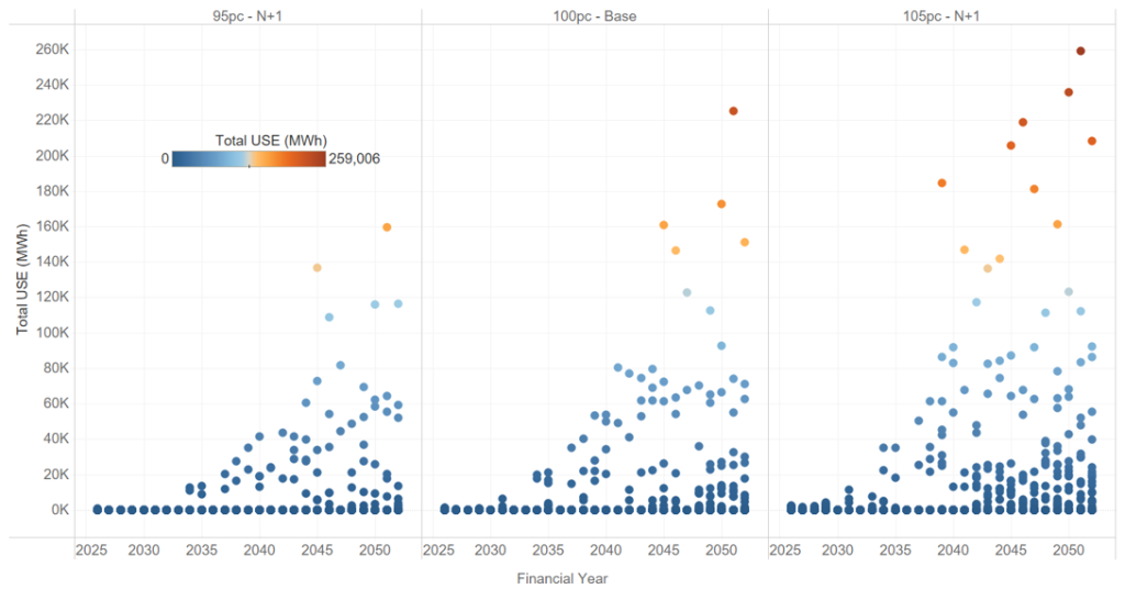
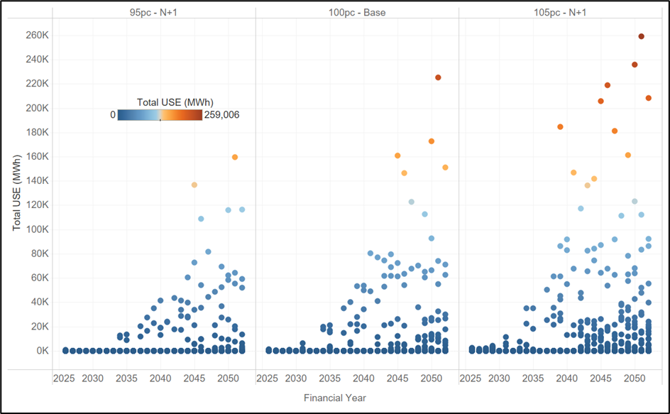
Figure 5 shows what surfaces when you look across the distribution rather than at its centre: projected unserved energy (USE) in NSW under the Endgame Sunny Side Up scenario, across 13 weather reference years and three demand sensitivities. In many years and sensitivities, USE is negligible. In others, it is not. A system that looks reliable on average can carry real unserved energy risk once the full spread of weather and demand it must withstand is accounted for, and that risk is invisible to any single central run.

Figure 5 – Projected USE in NSW for Sunny Side Up scenario across 13 weather reference years and 3 demand-supply sensitivities.

This is why “build to the average” is a dangerous frame. What keeps the lights on in a bad year is not the average outcome, it is the headroom the system carries against the tail. A plan that optimises to the centre will, almost by definition, treat that headroom as surplus and strip it out. The implication is uncomfortable but hard to avoid: the Electricity Statement of Opportunities (ESOO), in its current form, is no longer fit for purpose as a resilience instrument. A framework anchored to a narrow band of demand probabilities and weather years cannot characterise the risks that live in the tails, and those risks are exactly what we most need to understand.

4. New tools, wargaming and stress testing can greatly improve existing frameworks

None of this is an argument for discarding the ISP or the ESOO. The discipline they impose is real and worth keeping. We see the task in four parts: designing better studies, building the capability to run them, reforming the institutions that commission them, and breaking the culture that has held all three back.

The first shift is in how the studies themselves are designed. Too much is currently assumed away in the name of tractability. A more honest approach would:

  1. Look much further into the future, to the system we are committing to deliver, not the system we have. The consequential question is whether the fleet we are spending billions to build will hold up under the weather and demand it will eventually face.
  2. Characterise the full distribution of outcomes, moving beyond POE10 and POE50 demand traces and the handful of weather years that conventionally underpin reliability assessments, and drawing on much larger weather datasets.
  3. Treat unit commitment and system security as part of the study, not an afterthought. Having enough energy on paper means little if the system cannot be operated securely when conditions are at their worst.
  4. Bring gas demand and gas constraints inside the analysis. Gas-powered generation is the reserve capacity the system leans on in precisely the conditions that produce unserved energy, yet gas supply and transport limits are too often left at the edge of the model.
  5. Deliberately try to “break” the system, actively hunting for the weaknesses and holes in the current approach, rather than assuming away the tough questions because they are inconvenient.

We can change our current planning frameworks using:

  1. New tools. We need models that can be run faster, more cheaply and at far greater scale, so that exploring thousands of plausible futures becomes routine rather than exceptional. The combinatorics of weather, demand and outages cannot be brute forced with tools built for a handful of deterministic runs.
  2. Wargaming. Borrowing from the security world, ‘blue team / red team’ exercises are a powerful device: one team is tasked with finding ways to break a future system, while the other works to remedy the weaknesses they expose. The adversarial structure uncovers failure modes that a single, consensus seeking study tends to overlook.
  3. Stress testing. The aim is not only to ask whether a system is reliable, but to work out what it would take to break it. Knowing the distance to failure, and the conditions that get us there, is far more useful for decisions than a single pass/fail verdict against a central case.

5. Reforming the frameworks and the institutions

Better methods will not stick unless the regulatory framework asks for them, and two reforms stand out.

The first is to overhaul the ISP so that its centre of gravity shifts from transmission to the viability of the system as a whole. The process should assess future system needs and how the system will actually be operated, answering questions such as what the gas system will need to provide, what the system security requirements are, how the system will be operated through difficult periods, and what margin of safety is required to deliver adequate outcomes for society.

The second is to stand up an independent panel to stress test the system. A standing panel of industry experts should run stress testing and wargaming exercises on an annual basis. To keep them free from political interference, the exercises themselves should not be public, but the panel should publish a public facing report setting out its findings and recommendations. That structure preserves candour while keeping the conclusions accountable.

6. Breaking the groupthink

Underneath the technical and regulatory questions sits a cultural one. The current lack of innovation in how we model the future power system has produced a textbook case of groupthink: the same findings are confirmed again and again, and the ISP and ESOO processes are so heavily regulated that there is little room to do anything differently. The result is a planning conversation that mostly reinforces its own assumptions. Escaping it will take a governance structure that actively rewards new approaches rather than penalising those who depart from the consensus.

The NEM is becoming more weather dependent, not less. As thermal capacity retires and variable renewables and storage take its place, the gap between the average year and the bad year will only widen, and so will the cost of planning blind to it. The reasonable response is not to model the world as simpler than it is, but to confront its variability head-on: to treat stochastic inputs as stochastic, to plan for the distribution rather than its midpoint, and to build the margin of safety that resilience demands. This all starts with stochastic thinking.

Authored by: Kevin Yang, Matthew Bungate and Oliver Nunn

En route to freight electrification

The road to net zero will need to include Australia’s freight task and the economics are shifting fast.


Endgame Analytics is pleased to share the second instalment of our decarbonising transport research series, this time focusing on road freight and the commercial viability of battery electric trucks (BETs) for long-haul operations.


We modelled a B-double trip between Brisbane and Sydney and found that BETs are closer to cost parity with diesel incumbents than conventional wisdom suggests.


Some key highlights:

  • Cost savings are real: Off-peak charging delivers a 6% cost reduction compared to diesel, while even peak charging brings the BET to within 1% of the diesel equivalent.
  • Distance matters: Cost parity is achieved at around 700 km per day under our baseline assumptions — and falls to under 300 km if diesel prices sustain above $3 per litre.
  • Capital is less of a barrier than you’d think: The unit cost per tonne-kilometre is relatively insensitive to the upfront price premium of the BET, as long travel distances amortise the higher acquisition cost effectively.
  • But structural barriers remain: Charging infrastructure gaps, fatigue regulation misalignment, and a fragmented operator market mean commercial viability alone won’t drive the transition. Coordinated government action is needed.


The convergence of the electricity and transport sectors creates a genuine opportunity. Operators who engage actively with energy market dynamics through strategic charging and vehicle-to-grid participation stand to benefit most.

Read the full paper here

Fill out the form to download the Electrification of Freight PDF

Get in Touch

Endgame Analytics are helping clients navigate these interactions between policy, technology, and economic strategy.

  • Martin Chow, Director (Endgame Analytics) | E: martin.chow@endgameanalytics.com.au
  • Isaac Mann, Consultant (Endgame Analytics) | E: isaac.mann@endgameanalytics.com.au

Implications of the Electric Vehicle Transition for Transport Planning and Appraisal

The electricity market will change how we drive. Is policy keeping up?

Endgame Analytics is launching a new research series on decarbonising transport. We are pleased to partner with SCT Consulting to explore the emerging electric vehicle market and its growing nexus with the electricity sector.

The shift to Battery Electric Vehicles creates a bi-directional relationship where charging behaviour affects grid stability, and electricity market volatility dictates transport costs.

 Some key highlights:

  • Cost of Driving: BEV drivers will see fuel cost savings of between 65% to 100% compared to ICE vehicles, depending on when they charge — and with Vehicle-to-Grid technology, drivers could even be paid to charge.
  • Induced Demand: These lower operating costs have significant implications for future travel demand and congestion.
  • The Shadow Price of Mobility: Vehicle to grid technology introduces a new opportunity cost. Will drivers choose to forego a trip to capture the revenue from discharging to the grid?

Read the full paper here to understand the impacts on appraisal, policy, and the future research needed to support the transition. 

Get in Touch

Endgame Analytics and SCT Consulting are helping clients navigate these interactions between policy, technology, and economic strategy.

  • Martin Chow, Director (Endgame Analytics) | E: martin.chow@endgameanalytics.com.au
  • Isaac Mann, Consultant (Endgame Analytics) | E: isaac.mann@endgameanalytics.com.au
  • Seamus Christley, Managing Director (SCT Consulting) | E: seamus.christley@sctconsulting.com.au

Cutting through the noise 

Spot prices are the mechanism by which the energy market signals the needs of the power system to participants, investors, and consumers. So when we see something strange occurring in the behaviour of spot prices, it warrants attention. In this article we examine how spot prices are becoming more ‘noisy’ (ie, they are oscillating more frequently). We present analysis of spot price noise, some preliminary theories about what is causing it, and what the consequences may be. 

What do we mean by noise? 

First, we must define the concept of spot price noise. From a mathematical perspective, noise is the transient oscillation of a time series that is typically overlaid on top of some underlying trend. Note however that ‘noise’ is typically random, although it is not entirely without structure. 

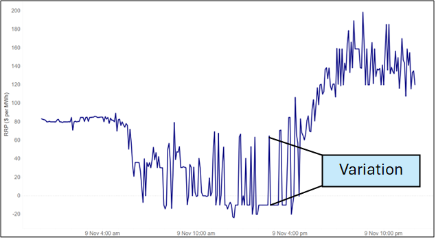
For our purposes, we use the mathematical concept of ‘variation’ as our proxy for noise – ie, the difference between any two consecutive intervals between the spot prices. For example, when spot prices for 4 intervals are $50, $100, $75, $20 then the variation outcomes are $50, -$25, -$55. Figure 1 illustrates the concept of variation on a recent day for NSW. 

Figure 1 – Illustration of variation; NSW 9 November 2025 

Given that we are not interested in scarcity events where prices signal underlying shortage of generation, we have capped all prices at $300 per MWh before calculating variation. We do not see these outcomes as noise, but rather an important signal in prices to reflect scarcity. In addition, when summing variation over time we will also use the concept of the absolute value of variation to capture both positive and negative movements, which might otherwise cancel each other out. 

Variation has been rising 

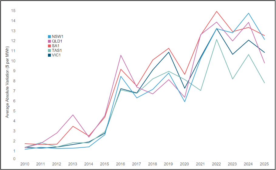
What has been happening to variation over the history of the NEM? Figure 2 shows the average absolute variation from 2010 to 2025 for each region of the NEM. The rise in variation is enormous. In 2010, the average difference between 2 dispatch intervals was around $1 per MWh across all regions; in 2025 that number exceeded $10 per MWh. 

Figure 2 – Average absolute variation by NEM region, 2010 to 2025  

What else do we know about variation?

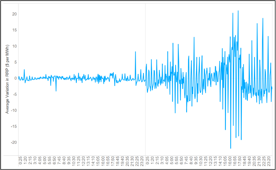
    Figure 3 shows average variation by time of day for NSW in 2010 and 2025. Two observations: 

  • Variation has increased across the day, but it is greater at some times than others. This would be expected due to the presence of the duck curve, but there are also increases in variation during the middle of the day and overnight.  
  • There appears to be a periodicity to the average variation in 2025 – it exhibits spikes that seem to occur with a regular frequency. 

Figure 3 – Average variation in NSW by time of day, 2010 versus 2025  

It is this second feature that is of most interest. Why should there be any intraday structure to the average noise if it is indeed just caused by random perturbations in the supply and demand curves? Is there something causing the noise that means it is in fact partially deterministic rather than purely stochastic? 

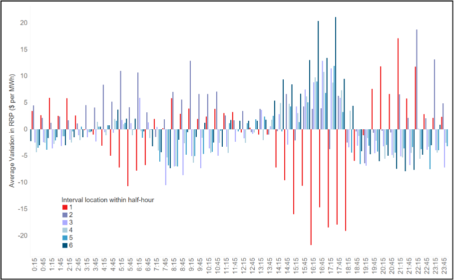
Figure 4 shows the average variation by time of day for NSW. To aid in the visualisation we have added colours to each observation based on where the dispatch interval occurs during the half-hour (ie, a number between 1 and 6). 

Figure 4 – Average variation in NSW by time of day, Calendar Year 2025  

The results are striking: 

  • The positive spikes in variation tend to occur in the last 5 minutes of the half hour (shown in dark blue). 
  • The negative spikes in variation tend to occur in the first 5 minutes of the half-hour (shown in red). 
  • There is a clear structure to the variation depending on the location within the half-hour. 

This seems to suggest that the ‘noise’ we are seeing is, at least in part, being driven by something structural that depends on the temporal location within the half-hour.  

Why is variation so structured? 

With 5-minute settlement having been in effect for some time, the temporal structure of variation is surprising – why does it matter whether it is the first or last interval of the half-hour? There are only two possible overarching causes: demand or supply. We start with a look at supply. 

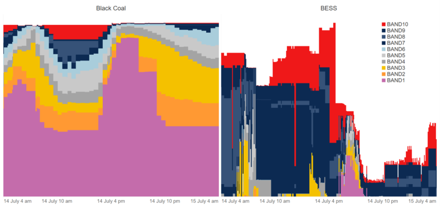
A simple analysis of bids in NSW reveals at least one possible reason for the structure. Figure 5 shows a recent sample of the aggregate final bid stacks for NSW Black coal on the left and NSW BESS on the right. Interestingly, the bid stack of NSW Black Coal is defined on a half-hourly basis, whereas BESS varies by 5-minute interval. 

Figure 5 – Sample of bids for NSW black coal and NSW BESS 

This would suggest that the supply curve is flat within the half-hour. We have analysed the bids for all thermal generators in the NEM, and a large proportion of them still supply bids on a half-hourly basis. Interestingly, Snowy’s bids are defined on a 5-minute interval basis. 

Much more analysis would be required to pin down the exact relationship between noise and the supply-demand balance. But at this stage, we posit that an increased variability in both demand and VRE have led to increased variability in the exact point at which supply clears against demand. At the same time, bid structures have remained relatively lumpy and have not (with the exception of batteries and some hydro) adapted to the changing conditions. The root cause of the change in noise warrants deeper analysis, but the 30-minute structure of bids seems a good starting point. 

What are the consequences of the increase, and possible vanishing, of noise?  

Noise is a big part of the battery business case. Noise lifts the highest daily prices and drops the lowest daily prices. This increases the opportunity for arbitrage by batteries. Indeed, the challenge of obtaining a high ‘percentage-of-perfect’ outcome is driven by the increased presence of noise, which makes it harder to time charging and discharging to achieve an optimal outcome. 

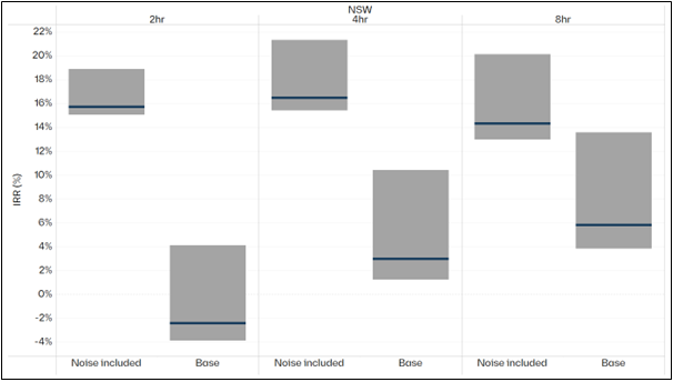
Figure 6 shows the range of returns to batteries in NSW of different durations with and without historical levels of noise being included in the modelling.

Figure 6 – IRR for indicative battery of different durations in NSW, noise versus base 

The shorter the duration of the battery, the more dependent it is on noise. This makes sense because as duration increases, the spread of each full cycle must capture higher buy points and lower sell points. 

Were noise to increase, the relative business case for shorter duration batteries would improve. Alternatively, were noise to decrease, the business case for shorter duration batteries would be more adversely affected than for longer durations. 

It follows that investors and market participants need to have a better understanding of how the inclusion of noise affects their projects, and to stress-test their models to include different levels of noise. 

Finally, we note that it is unclear whether noise is a feature or bug of the NEM. In particular, is it: 

  • a sophisticated signal provided by the energy only market, that we do not yet understand; or 
  • a pathological outcome of bidding behaviour that is making it harder to invest and make sensible decisions. 

More to come from us on this in the coming months. 

Stress-testing the NEM

Stress-testing the transitioning grid

Late last year we published a piece examining the importance of weather and stochastic variables to price outcomes. Since then, we have repeatedly been asked to explain how these stochastic variables behave, their influence on price outcomes, and the broader implications for the grid. We have been uplifting our own capabilities in modelling these stochastic factors. Most notably, we are increasingly conscious of the implications of there being a wide range of possible outcomes for reliability. Against this backdrop, in this article, we examine how outcomes differ when we alter weather and demand-supply (i.e., assumptions about adding or losing a major unit). We show that an analysis of median or average outcomes based on a single weather reference year, and a single set of demand assumptions is wholly inadequate for understanding variability, uncertainty and risk, and most importantly the reliability of the system. We want to stress test the system that is implied by a median set of conditions and see how it performs.

Moving from averages to distributions

The computational complexity of running market models means that it is costly in terms of time and computational resources to run many different simulations of the future. Average or ‘typical’ conditions are used as the basis for most long-term capacity expansion forecasts for this reason. Yet this is no longer enough. We cannot shoehorn a stochastic system into a deterministic model – we are misleading ourselves if we think that this will be adequate to guide us through the maze of complexity that awaits us in a high penetration renewable future.

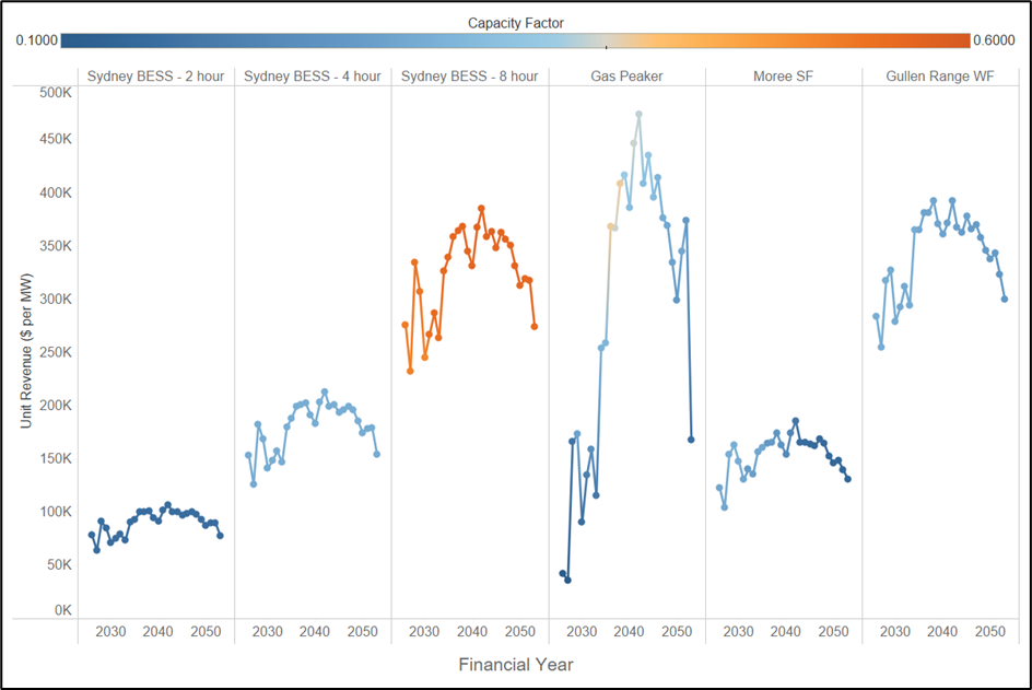
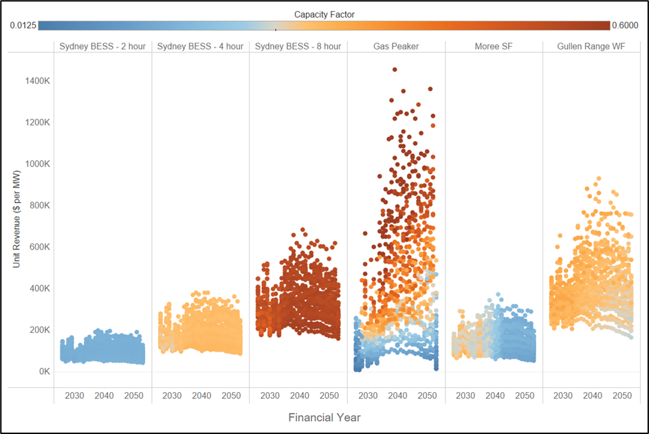
Figure 1 shows the average revenue per megawatt for a range of assets in NSW under a median weather reference year, and a single realisation of demand. For the purposes of this article, we have used Endgame’s Sunny-side up scenario as the basis for our forecasts. This scenario assumes a new build profile that is based on a median weather reference year, with a high (POE10) assumption about demand. The colour scale shows the capacity factor of each of the assets. We note the following:

  • Longer duration batteries make more money per MW of installed capacity.
  • Gas proves its value later in the horizon, as renewable penetration increases.
  • Wind makes solid returns because our modelling assumes constraints on the new build of this technology, limiting new entry from competing away profits.

Figure 1 – Revenue per MW for a single weather year for assets in NSW

But how does this picture change when we consider many different reference years and allow for ups and downs in supply (eg, N-1 or N+1 relative to forecast). The result is shown in Figure 2. Each dot represents a single realisation of revenue per megawatt for a single year.

Figure 2 – Distribution of revenue per MW for 3 demand sensitivities, 13 weather years

We observe the following:

  • The upside for longer duration batteries is far greater than for shorter duration batteries.
  • The range of outcomes for wind is far greater than for solar.
  • The most striking outcome is that gas generation can earn super-normal profits in some years, and in other years it can fail to earn anything.

What does this mean for the gas supply system?

The differences between the outcomes in Figure 1 and Figure 2 completely changes how we should think about each of these assets, and the system as a whole. For example, consider the implications for gas consumption via gas-powered generation (GPG). Figure 3 shows the differences in total GPG consumption across each weather year and demand sensitivity. We can see differences in a given year of up to 120 PJ across the southern states.

Figure 3 – Distribution of GPG for 3 electricity demand sensitivities, 13 weather years

This gives rise to many questions, such as the following:

  • What does this mean for planning purposes?
  • What is the value of ‘insurance-style’ assets that can deliver gas in outlier years?
  • How resilient is our current system to these types of events?
  • How do we reward gas production and transportation and long duration pumped hydro facilities that may only be required with a low probability?
  • What does this mean for gas turbines that are contracting for gas supply?

Indeed, the consequences are too many to enumerate here. But the key point is that unless we understand the distribution of outcomes, we have no chance of planning for the future that awaits us.

Stress testing to understand reliability

We have examined the consequences for gas, but what does this mean for system reliability? Our analysis shows that the variability of output for renewables has consequences for the reliance on gas. But what about unserved energy (USE) – ie, how often will weather and demand variability lead us to run short of generation, and how far are we at any point in time from shedding load?

Figure 4 below shows the consequences for unserved energy across 13 weather reference years and 3 demand-supply sensitivities. The result is that as renewable penetration increases over time, although the median conditions exhibit no USE, the distribution has long tails.

As the system becomes more stochastic, the importance of considering these extreme events only grows. By the 2040s we are in a situation where a shock to the system leads to outcomes that would not be considered reasonable by consumers (eg, 50-100 times the reliability standard in NSW). We note that these are driven by plausible and quantifiable variations in supply and demand, rather than ‘black swan’ events that may be examined by others in the sector.

Figure 4 – Projected USE in NSW for Sunny-side up scenario implied by distribution across 13 weather reference years and 3 demand-supply sensitivities.

This is not intended to be taken a criticism of renewables, but rather an observation that current modelling of single realisations of the future is inadequate to inform the needs of the system. We need a different approach. We make the following recommendations:

  • We need to start stress testing the system of the future, and understanding how variability in weather, demand, and gas supply influence reliability and resilience. In our opinion, the current ESOO is a solid starting point, but does not address the question of how we should go about filling the gaps that it identifies.
  • We need to think about how the assets that will provide resilience to these events will be rewarded in the market. Even with a very high market price cap, a generator that is only required under very extreme circumstances may never get built because of the challenges of obtaining financing for assets that are only used in 1 in 50 or 1 in 100 year events.
  • Finally, stress testing needs to consider all elements of the energy supply chain. From gas supply to hydrology and network availability. Models that can provide insights into these risks will help us build a system that exploits the many advantages of renewables, but recognises and addresses the blind spots of a high VRE system.

In conclusion, we need to understand that the nature of risk in this future system is fundamentally different to that which existed in our legacy system, and that our existing approaches may give highly misleading answers as to reliability and risk.

Eternal sunshine – recent and projected patterns in solar performance

We have seen solar and batteries at the core of government schemes over the last year, and indeed further back in time. In addition, the Commonwealth has sought to make the most of solar resources by encouraging consumption during the middle of the day with its Solar Sharer Offer. And finally with the challenges facing the roll-out of wind, gas and pumped hydro projects, we are left in a world where many of our clients have said to us that solar is the only option for investment. Against this backdrop, we ask the question how hungry is our current market for solar, and what can we learn about the returns that solar will earn from the energy only market?

Average prices in 2025

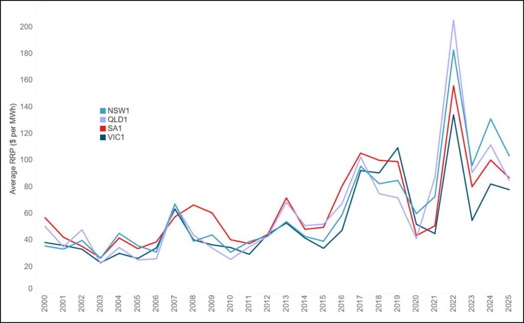
As a starting point, we examine historical average prices for the mainland regions of the National Electricity Market (NEM). Figure 1 shows that 2025 prices were lower in all regions than 2024 prices but have risen from their levels in 2023. New South Wales experienced the highest average price of $103 per MWh, with Victoria the lowest at $77.9 per MWh.

Figure 1 – Average calendar year prices for mainland regions of the NEM, 2000-2025

Average prices for different periods of the day

Average prices are a good starting point to understand the returns to solar, but the marked feature of prices over the last decade has been the deepening duck curve.

Figure 2 shows the average dispatch price by time of day for Victoria in 2025. We have coloured the different times of day according to solar output during these periods, namely:

  • Solar hours, which are 8 am to 4 pm.
  • Solar shoulder hours, which are 6 am to 8 am and 4 pm to 6 pm.
  • Overnight periods, from 6 pm to 6 am.

The belly of the duck (ie, the solar hours) is markedly lower than the shoulder and overnight periods, as has been seen for some time.

Figure 2 – 2025 average Victoria prices by time of day, coloured by solar definition

An immediate question is how prices for each of these time periods have changed over time with the increasing penetration of solar. Figure 3 shows the Victoria quarterly average price for each of the three categories: solar hours, solar shoulder, and overnight.

We note the following:

  • Over the period from 2010 to 2020, overnight and solar periods experienced very similar outcomes, but from 2021 onwards there has been a marked divergence between solar and overnight periods.
  • Prices for solar hours have collapsed in recent years and have now often become negative on average for entire quarters, namely Q4 2023, Q4 2024 and Q4 2025.
  • There is a clear quarterly pattern emerging with the highest prices in Q2 and Q3.

Figure 3 – Victoria quarterly average prices by solar category, 2010 to 2025

Bringing revenue into the equation

Average price is a very helpful indicator of the available pie for solar, but if we want to look more deeply at returns it is necessary to incorporate dispatch volumes, which vary greatly over the course of the year. With that in mind, Figure 4 shows the monthly revenue and generation by solar category for all solar farms in Victoria for 2025.

We note the following:

  • 38 per cent of all revenue is earned in the solar shoulder, with the remainder coming from solar hours.
  • Counterintuitively, the vast majority (ie, 90 per cent) of revenue from solar periods is earned winter when output from solar is at its lowest. Indeed, revenue from solar periods was negative during Q4.
  • The relationship between generation and revenue is not straightforward – more generation does not necessarily lead to more revenue, because when we generate during the year matters.

Figure  4 – Revenue and generation across all solar units in Victoria by solar category

Looking to the future – solar earns the bulk of its revenue in winter

We can also project forward to see how the system will evolve using one of our house scenarios, ie, Endgame’s Sunny Side Up Scenario. Figure 5 shows average Victoria revenue per MW for three financial years by month and solar category for this case.  We project that the pattern of the increasing significance of winter continues – indeed, by 2039-40 our modelling shows that solar will earn virtually nothing from September to March save for the small amount of output during the solar shoulders. In addition, the relative importance of the shoulder decreases from around 30 per cent of revenue to 16.5 per cent by FY2040.

Figure 5 – Projected Victoria solar revenue per MW; FY2030, FY2035, FY2040

What does this mean?

Solar revenues in summer have collapsed. Solar must now justify itself through contribution to the system during winter, particularly when the system is becalmed, ie, when wind output is low. Even with the large amounts of batteries that are projected to enter the system, this outcome does not change. The success of solar, and particularly rooftop solar, has led to a world where the system will be awash with energy in summer and so the marginal value of the technology is greatest when its output is relatively low.

We conclude with the following observations:

  • Solar earns most of its money when it is operating at a relatively low proportion of nameplate capacity. It follows that any curtailment which occurs during summer may be largely irrelevant to the overall revenue of a site.
  • Financiers need to be comfortable that they are buying an asset that makes most of its money when it is generating well beneath its capacity. Our own modelling shows that large proportions of solar revenue may come from periods where it is generating at less than 30 per cent of nameplate.
  • The massively seasonal nature of solar revenue makes a strong case for seasonal storage of any form of energy. Technologies that can move megawatt-hours between seasons will be extremely valuable in this context.
  • Given the large amount of variability in the occurrence and frequency of wind droughts from one year to the next, it follows that solar spot revenue will be incredible volatile. This is borne out by our own analysis of outcomes for different weather reference years. Batteries cannot mitigate this risk – deeper forms of energy storage and gas are required to hedge load.

Getting back to basics: LRMC in a renewable system

The challenges of building gas and wind have left many in the industry turning to a combination of solar and batteries as the answer to the transition. But what is the relative cost of building enough solar and storage capacity to meet power requirements 24 hours a day, 365 days a year, for a reasonable set of conceivable weather years? And how much more does it cost than including wind and gas in the generation mix? Against this backdrop, in this article, we ask: what is the long-run marginal cost of supplying a flat load for various allowable sets of technologies?

The concept of Long Run Marginal Cost

Marginal cost refers to the additional expense incurred to produce one extra unit of output. Marginal cost is a critical concept in microeconomics and economic regulation. Importantly:

Marginal costs look to the future, not to the past: it is only future costs for which additional production can be causally responsible; it is only future costs that can be saved if that production is not undertaken.

-Alfred Kahn

There are both short run and long run notions of marginal cost. The distinction is whether all factors of production are fixed or can be varied, ie:

  • the short run marginal cost is the cost incurred to produce one extra unit of output, holding at least one factor of production constant; and
  • the long run marginal cost is the cost to produce one extra unit of output assuming all factors of production can be varied.

We will focus on long run marginal cost (hereafter ‘LRMC’). There are many ways to estimate LRMC, but for the purposes of this discussion we will use a standalone or greenfields method. This roughly assumes the cost to rebuild the whole system from scratch. LRMC is therefore equal to the average system cost were we to rebuild the whole system from nothing.

The key word to consider here is average. The art of estimating LRMC lies in what we average over. Do we consider a single day, a single month, a single weather reference year? Or do we average over all possible outcomes? The challenge is that there can be significant differences between the costs of supplying a megawatt-hour of energy depending on when that megawatt-hour is consumed.

For the purposes of this discussion, we consider a broad possible set of megawatt-hours, ie, how much it costs to supply one megawatt hour, when that megawatt-hour could have been consumed in any of the last 13 years. This is effectively saying that the cost of building a resilient system is the cost to supply energy under any weather conditions that have prevailed in recent memory.

LRMC versus levelised cost of electricity

It is critical to understand the difference between LRMC and the levelised cost of electricity (LCOE). Before the advent of renewables, LCOE was a helpful way of comparing technologies like coal and gas, whose output closely matched the profile of demand. But when the profile of generation from technologies varies greatly over time – as is the case with renewables – this simplistic measure ceases to be relevant. Indeed,  LCOE provides highly misleading estimates of cost because it does not capture the time-dependent nature of generation costs, ie, that there are some times of the day or year that are significantly harder to supply.

Consider the profile of a solar plant. This profile is drastically different to the profile of system demand, wind output, or simply a flat load. LCOE is the average cost of generation, not the average cost of supplying load. It tells us the cost of generating some profile of output, not the cost of meeting demand. This is a critical difference, because it means that LCOE is now of virtually no benefit in understanding the costs that consumers face.

So what is the LRMC of a unit of energy?

We start by considering the LRMC when all technologies are available. For explanatory purposes, we have calculated the LRMC on the basis of supplying 1 GW of flat load. Figure 1 below shows the generation mix that our optimisation model yields: 1.5 GW of wind, 1.3 GW of solar, 0.3 GW of 8-hour batteries, and 0.8 GW of gas. The total cost – and so the LRMC – of the generation is $122/MWh (the sum of the system costs shown on the graph, dividing by the load served over the year).

Figure 1 – 4 GW of capacity are required to meet 1 GW of load at least cost

Optimal generation mix to supply 1 GW of flat load, NSW, median weather year

But what if we limit the set of allowable technologies. Figure 2 shows the generation mix and the change in cost (on a dollars per megawatt-hour basis) from removing wind, gas, and both wind and gas from the system.

Figure 2 – As we remove technologies from the mix, LRMC rises massively

Optimal generation mix to supply 1 GW of flat load and related sensitivities, NSW, median weather year; attendant LRMC shown in bottom panel

We note the following:

  • In the absence of wind, the LRMC rises from $122 per MWh to $146 per MWh.
  • If we remove gas from the equation, the LRMC rises from $122 per MWh to $230 per MWh.
  • A system that relies solely on solar and batteries will have a cost of $371 per MWh, ie, $3.2 billion for a single year.

What happens when we change the weather reference year?

An important input assumption is the weather reference year, ie, the assumed temperature, wind and solar irradiance profiles that underpin the modelling. Figure 3 shows the same analysis as Figure 2, but for 13 weather reference years. The difference between the median and the extreme outcomes can be substantial and speaks to the resilience of the system.

Figure 3 – The cost of a new system depends on the assumed weather

Optimal generation mix to supply 1 GW of flat load for 13 reference years versus attendant LRMC, NSW.

What does this mean?

I draw four conclusions from this analysis:

  • First, running a reliable, high penetration renewable system without gas is virtually impossible. If we really believe in the need for renewables, we must work out a solution for the supply of gas and gas-powered generation as well.
  • Second, in the absence of wind, the cost of the system is substantially higher, particularly when we consider the outcomes across different weather years. If we want to reduce costs for consumers, we need to work out a way of getting wind into the system, and that will require not just investment in wind but also transmission.
  • Third, building a system that is resilient to all weather conditions will be markedly more expensive than one that is reliable ‘on average’, unless we have access to all available technologies.
  • Finally, even in the world where we consider all possible technologies, the LRMC is markedly higher than many of projections that we see across the market. We need to level with consumers that wholesale prices will have to be higher than historical levels to make investments whole.

The narrative that we can complete the transition with solar and batteries, ensure a reliable system, and keep prices low is fundamentally at odds with the facts. Instead, we need to focus on unlocking constraints on technologies that can limit price increases and building a resilient system that can ensure reliable supply not just on average but at the extremes. If we continue to perpetuate the myth that solar and batteries can do everything, we will be left with a brittle, unreliable, and expensive system that does not meet consumers’ needs. Ultimately, this will hinder rather than help the transition.

The increasingly stochastic and volatile NEM

As a provider of market outlooks and price forecasts, we are constantly being asked to provide projections of the future. We are always asked to consider and incorporate different cost assumptions: fuel, capex, and fixed costs. In contrast, only a few investors and market participants are interested in understanding stochastic factors such as the weather. At the same time, our government and market body clients are increasingly asking for analysis that can help them understand the role of the weather, and so the resilience of the grid.

The transformation of the power system to a high penetration renewable world means that these stochastic factors and aspects of our methodology are increasingly relevant to price and dispatch outcomes. The truism that a weather dependent system is heavily influenced by weather conditions is often overlooked by market advisors.

In this article we seek to demonstrate how important weather conditions are for future price outcomes in the NEM. We aim to demonstrate that the use of individual weather reference years gives a limited picture of the future, whereas using a distribution reveals critical information of the future system.

Why does weather matter to price?

There are two main ways that the weather matters to the operation of the system, and so prices:

  • First, temperature conditions influence the demand for energy to heat and cool.
  • Second, wind speeds and solar irradiance determine the available supply of energy in the grid.

Temperature as a driver of demand

The first of these factors has always been an issue of major importance to the operation of the system. Figure 1 shows the relationship between temperature and Victoria demand for 2025, based on 2 weather reference years (ie, 2002 and 2019). Higher temperatures lead to higher demand for cooling; lower temperatures lead to high demand for heating. The vee-shape can be observed in all regions of the NEM, although the steepness of the arms of the vee depends on the amount of electrification and the degree of energy efficiency in each region.

Figure 1 – 2025 Victoria demand versus temperature, 2002 and 2019 weather years

Wind and solar irradiance as the drivers of supply

In contrast, the amount of solar irradiance and wind speeds are growing in their importance to supply in line with higher penetration of renewables. Figure 2 shows the relationship between wind output and price in South Australia over the last 10 years. Each bar shows the average price for each 50 MW bucket of wind output in South Australia. Here we see the rising significance of wind to price, and that when the system is becalmed prices tend to rise as lower merit plant is brought online. Similar results can be shown for solar irradiance, with effects on both the output of rooftop- and large-scale solar.

Figure 2 – Wind output versus price in South Australia over the last 10 years

Weather is a major driver of price in the 2030s

One of the powerful aspects of market models is that they can project how different weather conditions affect dispatch, and so price. Endgame offers its clients the ability to examine how different weather years affect market outcomes. Figure 3 shows the NSW annual average price as a percentage of FY2026 price for Endgame’s ‘Sunny Side Up’ Scenario, which sees a generation mix dominated by solar and storage. The figure shows 13 different lines: one for each of 13 weather years.

Figure 3 – NSW average annual price as a percentage of FY2026, 13 weather years A graph of different colored lines

AI-generated content may be incorrect.

The critical feature of this modelling is that we can see that from FY2033 onwards, the system becomes highly weather dependent after the projected closure of a coal-fired power station. We have highlighted three years (ie, 2015, 2017, and 2019) to show just how wide the spread in prices becomes. We note the following:

  • The closure of coal kicks the system into a highly weather-dependent world, where outcomes vary greatly depending on how much wind and solar there is in the grid.
  • Price outcomes can be almost twice as high in an unfavourable weather year as in a favourable weather year.
  • Although not shown here, a large component of the value is derived from prices above $300 per MWh, meaning that volatility is a high driver of average prices in these worlds.

We must start to think about the distribution of prices as a function of weather

The use of individual weather reference years for pricing assessments overlooks a major part of the story of future price outcomes – ie, that the system is becoming increasingly volatile. There are three important implications of this:

  • First, this volatility will increase the cost and importance of hedging, ie, the cost and importance of insurance rises in line with risk exposure.
  • Second, generators that can manage this risk will be highly valuable, and so this volatility has massive implications for the business cases for storage and gas-fired generation.
  • Finally, changing weather means changing supply. As the climate changes, we must increase our margins of error to account for changing weather patterns. Very little analysis has been completed on this front – we need to assemble more information about how climate change will alter weather patterns, and so the nature of grid supply.

Analysis of multiple weather years is inherently more complicated. But without the additional insights that come from looking at the shape of the distribution, we are only seeing one dimension of the future picture. The system we are building is stochastic, and so our modelling needs to be as well.

a.
Level 31, 9 Castlereagh St, Sydney NSW 2000

Oops! We could not locate your form.

Get in touch.