Skip to Content

Party in the New-S-A

In this Weekly Dispatch:

  1. The South Australian government released their Electricity Development Plan which features our modelling.
  2. The AER released a report on the performance of the wholesale electricity market in 2024.
  3. The federal government approved HumeLink which will connect Snowy 2.0 to the grid.
  4. The AEMC made a final rule that allows aggregated CER to be dispatchable in the NEM.
  5. Workers earning less than $100,000 a year can buy EVs using low-interest loans.
  6. Podcast of the week: Alex Leemon chats about the characteristics of the NEM.

Opening the black box (Part 2 of 3)

A beginner’s guide to wholesale market modelling

Context – where we left off

Last time we spoke about the use of wholesale market models to answer a wide variety of questions across the energy sector. We described the concepts of linear programming, solvers, and even how we derive prices from these tools. We then explained the first step in the modelling process – capacity expansion modelling, which allows us to determine the least-cost combination of generation technologies to meet demand.

But there were some aspects missing from our capacity expansion model, because of the computational complexity of including them. We concluded by foreshadowing the next step in the standard modelling framework, ie, the simulation of real-time dispatch – the subject of this second article.

Part (2) Operational dispatch modelling – creating a more granular picture

Having built the arena, the next step is to watch the operation of the system play out. There are three specific factors that we wish to capture in more detail in this process:

  • Bids from participants.
  • Detailed operational plant limitations, such as ramp rates, minimum-stable levels and outages.
  • Variation in renewable energy and demand traces.

We note that there is no reason that a capacity expansion model could not have captured each of these factors, save for the computational burden of doing so. When we have limited time and resources, it makes sense to ‘lock the build’, and examine these other factors in more detail.

The process is to run a time-sequential simulation model, which takes as an input the technologies and capacities from the capacity expansion model. This is a far simpler problem, which can be run many times over with different inputs for demand, renewable energy traces, fuel costs, and any other parameters of interest.

In the remainder of this article, we will examine each of the three factors described above, and how they are handled in the dispatch modelling.  

Choose your poison – bidding assumptions

Let us start with the most important, most controversial, of all assumptions: bids from technologies. So often when we try and explain a strange phenomenon in the market, the answer comes back: bidding behaviour. An unexpected price spike to the market price cap – bidding behaviour; counter-price flows on an interconnector – bidding behaviour; high prices for sustained periods on a mild day – bidding behaviour. Indeed, if one is at a loss for explaining a phenomenon, the best bet to avoid embarrassment is to give a sagely shake of the head and appeal to the higher power: ‘bidding behaviour’.

Bids are of such great importance because they collectively give rise to the supply curve that, together with demand, is responsible for price formation. And because demand is highly inelastic – ie, it does not respond to price – it is the supply curve that is responsible for a many of the phenomena in the sector that are otherwise inexplicable.

But what bidding assumptions should we use? Bids can vary from day to day, hour to hour and, even in some cases, minute to minute because of rebidding. Although it is entirely possible to reconstruct outcomes given historical bids, making projections about future bidding behaviour is far more complex. This is particularly the case in an environment where the technology capacity mix is changing, eg, when new plants are rapidly entering the system, or older plants are retiring.

The Holy Grail of bidding assumptions is some mechanism for determining how plants will bid in their capacity in any future world, whether that world be defined by:

  • a high penetration of low-cost renewables,
  • an aging and less reliable thermal fleet,
  • an increasingly interconnected system, or
  • any combination of the above.

Despite many claims to the contrary, no such mechanism exists. Yes, it is possible to create bids based on rules, or game-theoretic frameworks, but in the end they all result in the same outcome – players will bid some proportion (potentially none) of their capacity at a level that exceeds their short-run marginal cost. Some typical assumptions are as follows.

Approach 1: Contract bidding:

Players will bid in their contracted level of output at SRMC, but will then bid all remaining output with some mark-ups. A problem with this outcome is that we must assume a contract level. How contracting changes with changes in market conditions and the change of asset ownership will be difficult to forecast for every plant into the future, and so requires us to make assumptions. In effect, we are still assuming a supply curve.

Approach 2: Game theoretic bidding:

Players are assumed to bid based on the assumption of maximising their profit, subject to the strategies of other players. The assumption is that by iterating between players and giving them opportunities to change their bids, we will converge to a Nash-equilibrium (ie, a world where nobody has a reason to change their bids unilaterally). This is not mathematically correct – there is no assurance of convergence to a single Nash equilibrium given the way the supply curve is represented – and it drastically increases the computational overhead of the exercise, slowing down run times and forcing the modeller to make simplifications in other parts of the model. Moreover, the assumption that generators seek outcomes that are Nash is elegant but unrealistic. As one of my old colleagues was fond of saying: ‘I’ve never seen a rebid reason that says ‘Seeking Nash Equilibrium’.

Approach 3: Using historical, or other assumed profile of, bids:

In this case, Players are assumed to bid their capacity in at levels based on recent outcomes. This approach suffers from the weakness that the bids are once again being driven by the world we know and understand, and may not align with future changes in contracting behaviour, portfolio changes, or other developments of the system.

There seem to be no good solutions – one must choose their poison. At one time or another, we have used each of the above methods depending on the task at hand. But in general we have found that the approaches that limit the computational complexity (ie, Approaches 1 and 3) are more favourable, because they allow us to investigate different sensitivities to the supply curve. In addition, using historical information tends to provide a helpful reference point for any such discussion. For example, we can ask the question of ‘what happens if more generation is bid in at the market price cap than historically’, or ‘what if batteries start to bid more generation at a lower bid band’.

Regardless, there is no way to avoid the challenge that at its core we are making assumptions about future behaviours and that as the power system changes, the current information set we have will become more out of date.

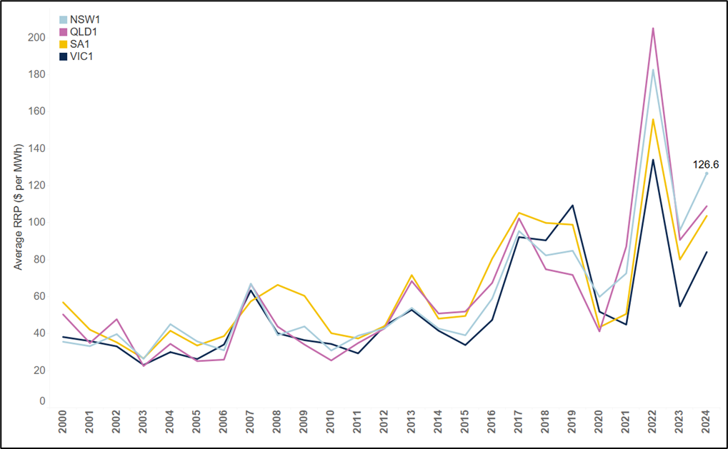
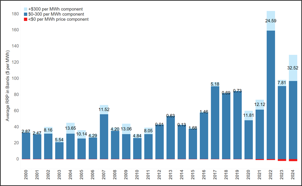
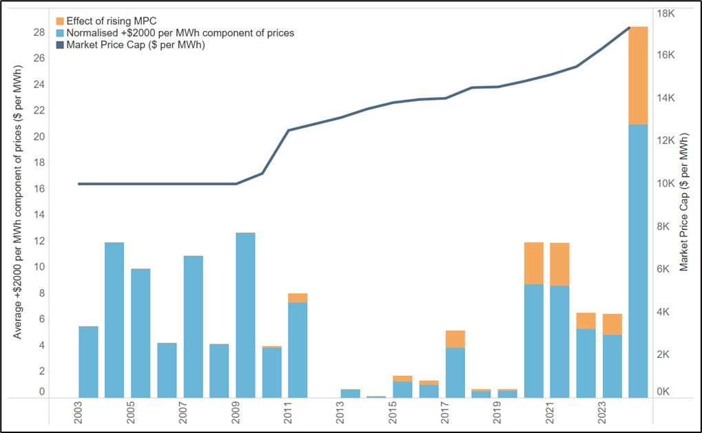
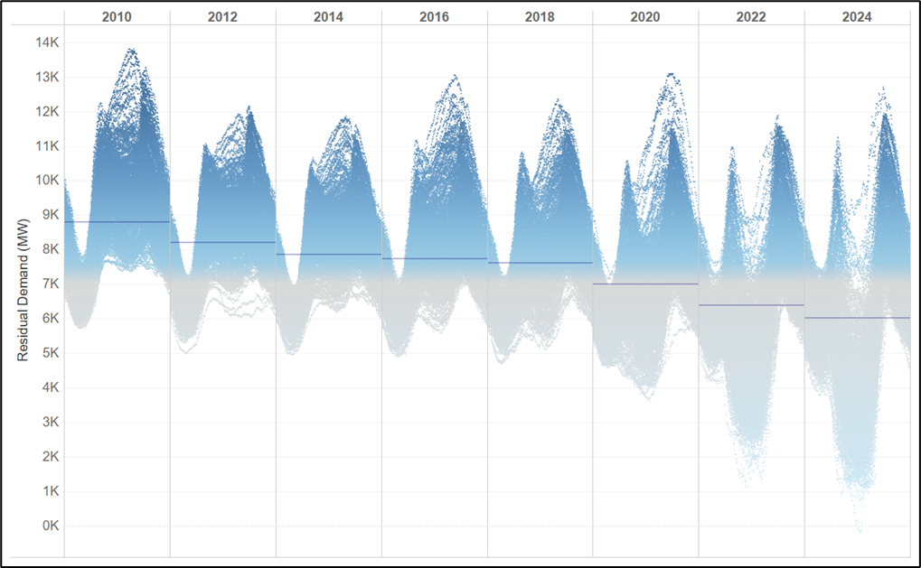
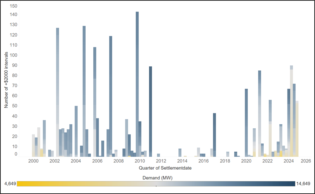
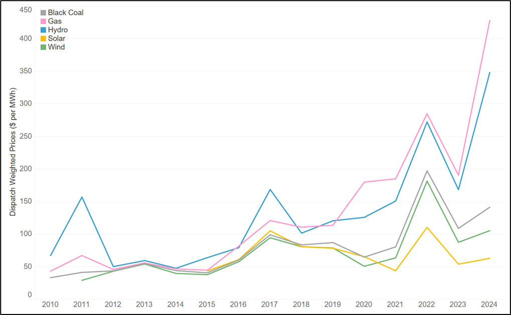
In addition, we recognise that all existing models are poor at capturing the type of volatility (ie, instances of super-high prices well in excess of the $300 – $500 range) that are so important to market outcomes. This is because volatility occurs in the actual market due to unexpected transient factors such as system constraints (ie, temporary local FCAS constraints due to the risk of islanding), occasional bidding behaviours that are often quickly outcompeted by competitor responses, and unexpected major events such as an explosion at a major unit or lightning strike on a transmission line. Put simply, the reason why super high prices are difficult to forecast is not because the market model is not “good enough” (eg, 30-minute vs 5-minute resolution) but because the modeller cannot systematically forecast transient market disturbances. Where these super high price volatilities are included, they typically occur through post-processing of results, such as adding some historical “noise” component – it is not an outworking of the model. This is a clear limitation of market modelling. Our advice is to be aware of this limitation and be suspicious of anyone who tells you they have a model that can forecast this type of volatility.

High fidelity modelling – capturing detailed operational plant limitations and outages

One of the benefits of ‘locking the build’ is that we can simultaneously unlock large amounts of computational power to capture other factors. This can come in the form of more runs of the model (see next section), or in the form of increased fidelity of representation of the system.

There are three, and potentially many more, ways that this computational windfall is spent. The first is the inclusion of operational plant limitations, such as ramp rate and minimum stable level constraints. Historically ramp rates were generally of limited importance because of the relatively small amounts of ramping required across the system. But with the advent of renewables – in particular solar – minimum stable levels in the middle of the day and ramping on either side of the morning and evening peaks have become more and more important. Dispatch models can easily capture the inter-temporal restrictions on generation caused by limited plant flexibility, and so the benefits of fast-ramping technologies are more evident.

The second change in the dispatch modelling is the use of outages. Now here we face a conundrum: how is one best placed to capture the effect of outages, given that they are a random variable. In some studies, such as reliability modelling, we are not just interested in one realisation of outages, but in the distribution of outcomes across many potential different outage traces. Such modelling often involves rerunning the same model hundreds or even thousands of times to build a picture of the distribution of unserved energy. Here again we see the benefits of the dispatch model being simpler and faster – we can spend the computational windfall on running many different simulations, rather than just one.

But what if we are restricted to just one simulation? It would seem that in this world, we need some concept of a ‘normal’ outage pattern. This is indeed the approach that is taken by most modellers. For example, some modellers derate all capacity uniformly over the course of the year. However, this averaging approach tends to crimp volatility further, because it does not capture the extreme events which occur when outages are greater than their long-term average. We have typically adopted the approach of examining many different outage profiles and selecting the median profile according to a metric of the frequency of extreme events. Regardless of the approach adopted, it is important to understand the degree to which outages are affecting outcomes, because a single sustained outage at the wrong time can lead to a massive impact on reliability.

These factors tend to provide more granular results, because they impose additional constraints. All else being equal:

  • Operational plant limitations tighten the ability of the plant to respond to system fluctuations, so they increase the daily price spread.
  • The inclusion of outages removes generation from the supply curve, so it also acts to lift price.
  • More generally, any factor that adds constraints to the system will tend to lift price, whether that constraint be in the form of interconnector losses, complex heat rate equations or even cycle limits on batteries.

When all is said and done, these many different factors can give a great deal more shape to prices, as well as leading to different marginal costs or prices being observed in the system.

Diving into distributions – variation in renewable energy and demand traces

We have described using the computational windfall from locking the build that comes out of the capacity expansion model to increase the complexity of dispatch. But another way to spend that windfall is by running our dispatch models many times. This is particularly important when we want to understand how random factors influence outcomes.

We can look at many different potential realisations of a random variable, to understand not just a single point estimate of outcomes, but an entire distribution. This can help us answer questions like:

  • Can our power system withstand extreme demand events?
  • How might different weather conditions (ie, temperature, wind and solar irradiance) lead to different outcomes, and how different are those outcomes from one another?

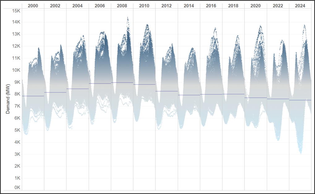
The key here is to create the inputs – ie, the weather and demand traces – that will feed into these simulations. In the National Electricity Market, the market operator publishes a range of traces for demand and weather going back 13 years. But we can go further using historical data sets such as the MERRA-2 data set to create a longer history. The challenge is always to ensure that the weather and demand conditions are correlated. For example, it would be a mistake to use temperature from 2011, but wind data from 2022. The two would be misaligned with the potential for outcomes like high output from wind farms occurring at the same time as high temperature outcomes in summer. In general, the solution here is to ensure that all the trace variables are aligned, and so it is not possible to ‘mix and match’ traces without compromising the value of the exercise.

In the event that a model requires even more data than is historically available, the solution is to create synthetic data, which preserves the relationships between the variables, but which is generated using probabilistic machine learning or some other suitable technique. For more information about this type of approach, we refer the reader to Probabilistic Deep Learning by Oliver Dürr and Beate Sick.

Once we have run the model across all the available data, we can look at the distribution of outcomes and see how much additional information has been revealed. In our opinion, this type of ‘stress testing’ is massively underapplied across the sector. And even when it is applied, for example in reliability studies, not enough analysis occurs of the distribution of outcomes. As more and more data sets become available, and the system gets more and more dependent on random factors, this type of approach will become increasingly powerful.

Where to from here?

So we now have an end-to-end modelling process. But even after two articles, we have barely scratched the surface of the process. The power system is a complex beast, and a model that seeks to simulate its operation will be similarly intricate.

This intricacy can sometimes lead modellers to avoid talking about the fine details of their modelling and, in some instances, to use modelling to justify poor decisions.

With this in mind, we think that the most helpful tool for someone trying to engage with, or commission, energy market modelling is a guide to some of these tricks. In our final instalment of this series, we therefore examine the assumptions and methods – the Dark Arts – that your modeller would rather not talk about. Our intention in doing so is to arm you with the basics of ‘Defence against the dark arts’. This is the information you need to understand both what models cannot do, but more importantly the many powerful questions that can indeed be answered by modelling if we are able to stretch our understanding.

Everything Everywhere All at Once

In this Weekly Dispatch:

  1. The Coalition unveiled their nuclear plan costings.
  2. The Federal Government procured 6.4 GW of renewable energy comprised of 19 projects using the Capacity Investment Scheme.
  3. The CSIRO released their draft report on GenCosts for 2024-2025.
  4. AEMO released their draft 2025 inputs assumptions and scenarios report.
  5. The Danish Energy Agency’s latest offer for new offshore wind capacity in the North Sea drew no bids.
  6. Podcast of the week:  On Let Me Sum Up they talk about the forthcoming NEM review and the Climate Change Authority’s 2024 Annual Progress Report.

Opening the black box (Part 1 of 3)

A beginner’s guide to wholesale market modelling

Context – the evolving power system

Power systems all over the world are experiencing rapid and profound change. The last decade has seen an inexorable rise in the penetration of renewable generation technologies, ie, wind and solar farms. In the past, these technologies accounted for only a small fraction of total electricity supply. But now they are a critical part of our power system, and their significance will only continue to grow. These are profound changes that have consequences for every part of the energy sector.

The need for models to help us address new challenges

Against this backdrop, there is now more focus than ever on how we can better understand the outlook for the power system. Despite their many detractors, wholesale market models are in widespread use across the sector – we seek to use these models to answer a wide variety of questions, including:

  • What combination of generation and transmission assets will we need to invest in to provide energy at the lowest cost?
  • What role will different technologies like wind, solar, storage, and gas plant play in a future system?
  • How might changes in the shape of demand alter these outcomes?
  • When can we retire existing high-emissions generation without adversely impacting reliability, security and the affordability of electricity?
  • What will be the prices in the worlds that we model above?

Despite their shortcomings, models of the future power system provide us with the power to design, understand, and stress test potential system configurations without having to touch the physical system. Tools such as PLEXOS and Gurobi are now in widespread use across the energy sector.

The wholesale market model as a ‘black box’

Notwithstanding the widespread use of wholesale market models, we have learned through our work in the energy sector that there is sometimes limited understanding of how these models work, their strengths and weaknesses, and how they can be adapted to fit different purposes. People regularly use the term ‘black box’ to describe wholesale market models. This term tends to be associated with results that cannot be explained, poor visibility of the linkage between inputs and outputs, and a lack of consistency across scenarios and sensitivities.

The problem is that all too often, wholesale market models are used to produce a single, highly aggregated answer. An entire study can be boiled down to a single result: a price of $72 per MWh, a capacity factor of 15 per cent, or even in some instances an answer such as ‘Yes’ or ‘No’. Indeed, we have heard about modelling studies where advisors refuse to provide more detailed information, usually on the grounds that such information leads to ‘greater scrutiny’. This type of approach enshrines the black box view of the system into our thinking, disempowers decision-makers, and undermines the role and power of modelling. 

Modelling to build intuition

But the ‘black box’ can be opened. One of the powerful elements of the models that are used in the electricity sector is that they provide us with virtually endless data that can allow us to understand outcomes better, to dig deeper into the operation of the system, and to build, challenge, and refine our intuition. Models can help us understand mechanisms that drive the outcomes we care about. For example, over the last few years the industry has developed an increasingly sophisticated understanding of wind droughts, and their interaction with firming needs. This in turn has led us to understand the significance of the availability of gas-fired generation, and the importance of constraints on the availability of gas.

Similarly, models have shown us that as we see increasing penetration of batteries, the short, sharp periods of high demand in summer that were previously the major driver of high prices will give way to longer periods of energy shortfalls in winter. To understand the solutions to these energy shortfalls, we have used models to answer the question: what is the best combination of resources to respond to wind droughts? We have learned that batteries alone cannot provide the energy we need to endure these periods. Modelling has helped us build our intuition about these events, and challenge ‘gut instinct’ which is wrong at least as often as it is right.

Intuition starts with understanding of the process

With this context in mind, we have prepared a three-part series on understanding how energy market modelling works. We seek to open the black box, and describe how these models work at a detailed level. We cannot hope to describe everything, but we will endeavour to shine a light onto some aspects of their operation that are often overlooked, avoided, and (in some cases) hidden from decision-makers.

The series is divided into three parts:

  • Building the arena – capacity expansion modelling
  • Operational dispatch modelling – creating a more granular picture of the future
  • Defense against the dark arts – assumptions and methods that your adviser would rather not talk about.  

 In this article, we consider (1).

Part (1) Building the Arena with capacity expansion modelling

When it comes to long-term modelling of the system, the biggest question is how the players/generators that make up that system will change into the future. Given a starting point, where we have a set of existing generators, we want to answer questions like:

  • When will the existing power stations close?
  • When will new generation enter the system?
  • What types of technologies will make up that new generation?

These models are sometimes referred to as ‘LTs’ standing for Long Term models. They work by taking a set of assumptions (described below), formulating the problem as a linear program, and using a mathematical solver to identify the least cost combination of new and existing generation that can satisfy demand.

What is a linear program?

Linear programming is a branch of mathematics that seeks to find the optimal solution to specific classes of problems, ie, ones where all the variables and constraints are linear functions. It is important to understand what we mean here by optimal – this word has a very precise meaning. In linear programming, we define a function (hereafter the ‘objective function’) that we seek to minimise or maximise. In a capacity expansion problem the objective function is the total cost of operating the power system – a function we seek to minimise. The optimal value of the objective function is achieved with the lowest cost combination of generation investment and dispatch and any other variables that we might consider, which satisfies all the constraints, such as meeting demand and delivering policy targets. We use a solver, such as Gurobi, to find this optimal combination that yields the least-cost solution to the objective function. For those who are interested, a good introduction to linear programming can be found in Linear and Integer Optimization by Sierksma and Zwols.

What is a solver?

A solver is a piece of software that implements a combination of different algorithms to find the optimal combination of variables that yields the optimal value of the objective function. Now here I must make a confession – to me most solvers have become so sophisticated that they are themselves a black box. Companies like Gurobi have invested decades in making their software faster and faster, and able to solve broader and broader classes of optimisation problems. Open an introductory textbook to optimisation, and you will find a description of solver algorithms that bears almost no resemblance to what commercial solvers are doing.

The critical point is that we do not (in general) need to know how a solver works to understand how to run the power system. All we need to know is that the outputs of the solver yield the very best solution possible to running the system. It is of course highly valuable to be able to understand how these tools work, but it is not essential to decision-making. All we need to remember is that the outputs of the solver, are the least cost way of operating the system. A pilot need not understand the millions of lines of code that help fly a plane, provided he understands the interaction between his actions, the controls, and the effect on the plane itself.  

Key assumptions or parameters

So we have decided that we want to find the least cost combination of generation to satisfy demand. What information do we need to do this in the power system? The standard array of inputs are as follows:

  • To capture transmission limitations, we need:
    • A topological representation of the transmission network, consisting of regions and connections between those regions.
    • Line limits that represent the maximum flow between regions.
    • Loss equations that relate flows on the lines to losses
  • To represent plant we need:
    • Capacities for existing plant
    • Fuel Costs
    • Hydrological data (ie, inflows and reservoir assumptions) for hydro-electric plant
    • Thermal efficiencies or heat rates
    • Variable and fixed operations and maintenance costs
    • Assumed profiles of resource availability (aka, traces) for wind, solar, and run-of-river hydro plant.
    • Capital costs for any new plants that might be build candidates
    • Potential locations for these prospective plants, and the depth of resources available in each location.
  • To represent demand, we need:
    • Traces for demand for each region of our topology.
    • Assumptions about the amount of solar PV, and behind the meter generation (be it batteries, VPPs, or other technology) that can be mobilised to help shift load.
  • Finally, to capture other constraints, we may need:
    • Assumptions about renewable energy policy targets
    • Assumptions about the cost of, or limits on, emissions
    • Any other factors that we may deem relevant.

Beyond this there are two additional overarching assumptions that are of critical importance:

  • A value of lost load or VOLL – this is the penalty that we assign in the model to a failure to have enough supply to meet demand;

A discount rate that can be applied uniformly across all time periods in the model, to translate costs in one time period into costs in another time period.

Decision Variables – what the solver is solving for

At this point, the reader may be asking the question: why have we made no assumptions about the new capacity of generation, when existing plants will retire, the amount of generation from different sources, or the flows on interconnectors. Aren’t these the very things that we are interested in studying?

Indeed, these variables – these decisions –  are our focus. But it is for precisely that reason that we have not assumed values for them. Instead, we leave it up to the solver to search and find the optimal combination of these ‘decision variables’ that yields the optimal outcome. The decision variables are:

  • When existing plants retire
  • What new plant is built and where
  • How all plants – be they new or old – are operated
  • The flows on transmission lines between regions
  • The amount of unserved energy in each region

Tightening the screws with constraints

Without constraints, a linear program is trivial. But we know that there are constraints on the operation of the power system that cannot be violated, whether it be because of the laws of physics, operational restrictions on plants, or some policy objective.

There are many constraints that we could consider, but for the most part they fall into four broad categories:

Supply-demand constraint: For each region,

Generation + Net Imports = Demand – Unserved Energy

Output limits: For each generator, for every time period

Generation <= Capacity

Transmission limits: For each transmission line

Minimum Flow <= Flow <= Maximum Flow

Intermittent limits: For each wind, solar farm:

Generation <= Max Half-hourly Output for a given trace

In addition, there are a wide variety of additional constraints that we could add to this list, including storage constraints for batteries and hydro assets, emissions budgets, and limits on the acceptable level of unserved energy. But for the most part, the vast majority of constraints in a capacity expansion model are shown above.

Outputs – what really matters?

Having defined our objective (ie, to minimise cost), chosen our input parameters, and implemented our constraints, the next step is to hand our problem to our solver to give us the answer. But what is the answer? Many people often assume that the answer is the value of the objective function, ie, the total cost of operating the system over the time horizon. But is this really that helpful? In fact what we are often more interested in are the values of the decision variables that yield this optimal value. We want to know what we should build, when we should retire existing plant, and how all of these facilities should be operated. Put simply, it is the value of the decision variables that are of most interest.

There is also a trick here – it turns out that when we solve a linear program we get some additional variables for free. In particular, every constraint yields a special value, called a dual variable or ‘shadow price’, that represents the effect of alleviating that constraint by an infinitesimal value. In the case of the Supply-Demand constraints, this shadow price has a very particular economic interpretation – it is the additional cost to the system of an additional megawatt-hour of demand. In microeconomic terms, it is the marginal cost of an additional unit of supply.

In a workably competitive market, this can be thought of as being the price yielded by a capacity expansion model. When the marginal cost of building a new plant is higher than the shadow price of the supply demand constraint (ie, the price) a new plant will remain unbuilt. But when the price exceeds the marginal cost, the new plant will be built. This is a desirable characteristic of the model, as it says new plants will be built up to the point where they make an economic profit, but not beyond that point.

Where to from here?

So now we have a means of planning out the system. We have a model that can help us project the new plants that will be built economically, the old plants that will be similarly retired, and how all these plants will work together to ensure supply meets demand. But there have been simplifications along the way – for example, we have not accounted for the following:

  • The ability for participants to bid above short run marginal cost.
  • Operational factors such as ramp rates, and generator outages
  • Other factors such as considering the effect of different traces for demand, wind, and solar.

One might ask why we did not simply account for these factors in our capacity expansion model. The answer is that were we to do so, the computational complexity would be prohibitive – the problem is simply too big to solve in one go, or even in large chunks. It is for this reason that the next step in a standard modelling framework is to simulate real-time dispatch – the subject of Part 2 in this series.

Mercury Rising

Recent NSW prices and the impact on customers

With the first of the hot weather arriving in Sydney, the New South Wales region of the NEM is seeing a number of Lack of Reserve (LOR) warnings. Moreover, recent contract price outcomes in the region are higher than at almost any other time save for the energy crisis of 2022. All signs point to a precarious position for consumers as we enter summer and, beyond that, 2025.

Against this backdrop, it seems timely to survey recent outcomes for price, demand and generation in NSW and to ask the question: what is happening to the price of energy in NSW, and who are the winners and losers?

Historical spot prices in NSW

We start by considering the basics – what are the recent outcomes for NSW spot prices, and how does this compare to historical outcomes? Chart 1 shows average annual spot prices for each of the mainland regions of the NEM on a calendar year basis from 2000 to 2024 YTD. We have highlighted the current year-to-date average for NSW of $126.70 per MWh. NSW spot prices are currently the highest of all four NEM regions, and are at an all-time high save for 2022, when outcomes were driven by the energy crisis.

Chart 1 – NSW Spot Prices are at record levels save for the 2022 energy crisis

Annual average spot prices on a calendar year basis for mainland regions of the NEM, 2000 to 2024 YTD

But this is not the whole story. Chart 2 shows the breakdown of these average prices into three bands:

  • Prices above $300 per MWh, shown in light blue.
  • Prices below $300 per MWh but above $0 per MWh, shown in dark blue.
  • Negative prices, shown in red.

The combined height of the three bars represents the time-weighted average price for the quarter, as shown in Chart 1. The different components show the contribution of each category of prices to the annual average. The recent outcomes for NSW in 2024 YTD show that the +$300 per MWh component prices are at record levels of $32.53 per MWh, with most of December still to come. Even during the energy crisis of 2022, the value of the cap never reached these levels.

Chart 2 – The value in the cap is at an all-time record level for NSW

Annual average prices by price band, NSW, 2000 to 2024 YTD

Is a rising market price cap the culprit?

One factor that has not been constant over the period shown in chart 3 is the market price cap (MPC). Chart 3 shows the historical progression of the market price cap since 2003 (ie, when the MPC rose to $10,000 per MWh) versus the average value of +$2000 per MWh prices (ie, prices representing scarcity pricing). We have capped all prices above $10,000 per MWh to show normalise for the effect of rises in the MPC. Even after adjusting for this, 2024 has been a record year, although the higher market price cap is making a substantial contribution to the additional value in the cap. This is not to say this is unwarranted, but merely to observe that changes in the market price cap over time are only partly responsible for the higher levels of cap prices.

Chart 3 – Even after accounting for a rising MPC, 2024 represents a new record for +$2000 MWh value

Count of number of intervals where NSW price exceeds $2000 per MWh by quarter, Q1 2005 to Q4 2024

What’s been happening with demand?

What more can we learn about what is happening here? For starters, it is helpful to have the background of what has happened to demand in NSW over the last 25 years. Chart 4 shows a plot of every 5-minutes of demand since 2000. By way of explanation:

  • Each panel of the chart shows the outcomes for a single year.
  • We have included only every second year (ie, 2000, 2002, 2004, …, 2024 YTD).
  • We have added a line to each panel showing the average demand for each year.
  • To aid in visualisation we have added a colour scale.

The change in the shape of demand is striking. Solar PV has crushed demand in the middle of the day, leaving two sharp peaks in the early morning and late afternoon/early evening. However, the time-of-day plot reveals that there are still extensive periods where the system needs to be able to cope with high levels of demand. Put another way, falling average demand has not removed the maximum levels of demand that we see in the system.

Chart 4 – The shape of demand has changed drastically over the last 25 years

Plot of all NSW demand outcomes by time-of-day for every second year, 2000 to 2024 YTD

We see a similar story for residual demand, ie, demand minus large-scale solar and wind. Chart 5 shows the same analysis as Chart 4, but for residual demand. Once again, the change is striking, with residual demand for NSW now reaching down to levels of almost zero net demand for energy. And yet we still see the upper envelope of maximum and peak demand remaining stubborn – periods remain where the system is reliant on dispatchable generation for the morning and evening peaks.

Chart 5 – Residual demand has reduced from around 9000 MW to 6000 MW in the last 15 years

Plot of all NSW residual demand outcomes by time-of-day for every second year, 2010 to 2024 YTD

So what is the relationship between extreme price outcomes (ie, where price exceeds $2000 per MWh) and demand? Chart 6 shows the count of the number of such intervals by quarter, coloured by the overall level of demand. We see that the outcomes over the past year are unprecedented – we have never before seen so many high-priced events for four consecutive quarters. What is more, these outcomes are occurring at relatively low levels of demand, often less than 10,000 MW.

Chart 6 – We have not seen 4 consecutive quarters with this frequency of +$2000 per MWh events

Count of number of intervals where NSW price exceeds $2000 per MWh by quarter, Q1 2005 to Q4 2024

Who are the winners and losers?

So prices are high and these high prices are being heavily driven by extreme price events, many of which are occurring at moderate levels of demand. Who are the winners and losers? To understand this, we have compiled a chart showing the dispatch weighted prices earned by each of the main technology types in NSW: solar, wind, gas, hydro, and coal. We note that this is only part of the story – the contract market has not been factored into our analysis. But our analysis still sheds light on the underlying question of what a generator can earn in the spot market – a relevant reference point for a Power Purchase Agreement (PPA), a standardised contract, or a physical hedge.

Perhaps unsurprisingly, the chart shows that gas and hydro are making record dispatch-weighted prices – even higher than during the 2022 energy crisis. But more remarkable is that coal is earning an astonishing $141 per MWh this year. Wind is also doing well relative to historical levels, with prices exceeding $100 per MWh in 2024. In contrast, solar is only seeing modest returns of $63 per MWh – about half of the average price in NSW.

Chart 7 – Gas and hydro are making record returns in NSW, while solar struggles

Dispatch-weighted prices for black coal, gas, hydro, wind and solar in NSW, 2010 to 2024 YTD

Conclusion

The prices in NSW are unprecedented, in terms of the amount of value that we are seeing in the +$300 per MWh component of prices. The big winners out of this are the thermal generators that can shape their generation to capture these prices. To a lesser degree, intermittent generators that are producing at all (ie, wind) during high price events are also capturing value. The clear losers are consumers, particularly residential consumers who draw more power during hotter weather. They can expect to be faced with much higher prices once these cap and swap prices flow through to the Default Market Offer. In addition, the frequency of high price events and the low levels of demand at which these are occurring suggests that the system is under extreme stress. If the trends to date continue in summer cap values will likely reach new records. Far from seeing prices fall as some commentators and institutions have suggested, the market is signalling that the wholesale component of bills in NSW will rise markedly.

a.
24.01, 9 Castlereagh St, Sydney NSW 2000

"*" indicates required fields

This field is for validation purposes and should be left unchanged.

Get in touch.